
3 Ways to Make a Clear Google Slides Graph
Here at SlideRabbit, we provide services in both PowerPoint and Google Slides. If you’ve tried to make a GSlides graph you know that there are some functional deficiencies to deal with. Recently, we were honored to lead a session on graphing in GSlides for Creative Pro’s PowerPoint Deep Dive event. Because graphing can be such a pain, we wanted to share some tips here as well.
With the increased need for a seamless remote collaboration experience, GSlides is gaining popularity. Unfortunately, the graphing is, in a word, clunky! If you need to express data visually in GSlides, here are the three main methods available for you.
Google Slides graph from Google Sheets
If you have complex data, the most accurate way to create a graph for your GSlides deck is to use Google Sheets. GSheets is Google’s answer to Excel, and though it’s boiled down, it contains similar functionality.
Rather than graphs living natively on the slides, in GSlides, graphs are generated, formatted, and designed in GSheets and then exported to a slide as an image.
Sounds simple enough, right? Well, unfortunately, there are some cons to setting up your graphs this way since GSheets is lacking in stylizing choices:
- The theme colors do not transfer to GSheets, you must set them up separately
- Limited fonts for graph labels
- Fine-tuning like series width and gaps don’t exist
- Graph images cannot be easily resized around other content once exported to slide
Cuter graphs with shapes!
Instead of trying to create and design your graphs in GSheets, with its limited options, consider designing your graphs with shapes.
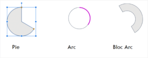 Of course, lines and bars are easy shapes to create, but GSlides also contains shapes perfect for pie & donut charts too. Try playing around with these elements to create a more infographic feel.
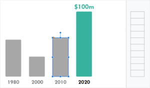 To make sure your data is expressed correctly, create a scale. The easiest way is a one-column table. Because the smart guides in GSlides snap to individual cell borders, you can easily test and resize your bars and lines to make sure the data looks accurate.
Shapes allow you to get more creative in the expression of data and to better match the look & feel of your deck.
Better looking, accurate graphs using a PowerPoint trick
PowerPoint has a lot of robust graph design options. You can create a quite nicely designed graph using data and all the fine-tuning options available. Unfortunately, when you import PowerPoint slides into GSlides, graphs will become uneditable images. Not ideal!
However, with just a few more steps, we can create nicely designed graphs from data and import those into GSlides.
How? Follow these steps in PowerPoint:
- Design your graph to your liking
- Create a blank slide after your designed graph slide – keep your real graph!
- Copy your graph item and then go to the blank slide and right-click for Paste Special.
- On PC, select EMF format for your graph paste. On Mac, chose SVG.
- Select the resulting item. On the “Graphic” tab, select “Convert to Shape”
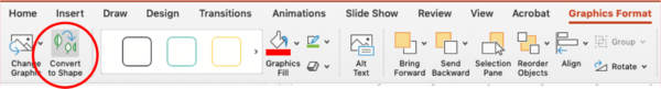
- Select the resulting group and Ungroup, then clean up any funky formatting
Your graph is now made of shapes, grouped by series for easy recoloring. You can now import this file and the shapes will convert to native GSlides shapes.
Graphing in GoogleSlides can be a bit of a headache, but there are creative solutions to creating any sort of graph you might need.
Want GoogleSlides out of your life? Let us help.


Leave A Comment
You must be logged in to post a comment.