
Creating a Beautiful Color Palette for your Corporate Presentation
Whether you’re building your corporate presentation around a brand color or you have more creative freedom, you need a functional and attractive color palette. While SlideRabbit is happy to help you develop your palette, there are some considerations to take into account when deciding how you’d like to proceed.
Marketing considerations: Color and mood
Are you working without a main brand color? If so, you have the freedom to start from scratch.
Think about audience perception: Which color category best fits the associations you want the audience of your corporate presentation to have with your brand?
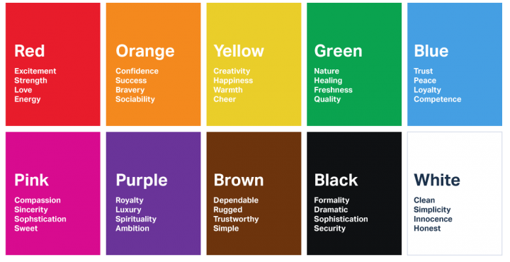
source: usertesting.com
Considering psychology in branding and marketing colors is a solid way to direct your color palette. When you find the hue that suits you, build from there.
Read more about marketing & strategic color selection.
Corporate presentation: Function and content
When it comes to presentation, it’s important to think about what content you’ll be working with. Are you sharing simple statistics? More complex graphs? Mostly images? Involved diagrams?
The most complex your content, the most important it is to have a diverse color palette, with many easily discernible colors rather than a monochromatic palette with many shades of one color.
Especially when it comes to graphing, if you need to show complex data sets, you’ll want to take that into account in your color palette development. Recognizable and bold colors will help your audience more easily process your data.
Read more about color theory and attractive combinations.
Help for non-designers: Our favorite online tool
Want a little help on your DIY? Check out Coolors!
Coolors helps you build a palette around a given color, or even pull a palette from an inspiration photo – a great way to find a palette that suits your branding direction.
Let’s be friends! Connect with us on Facebook, Twitter or LinkedIn!


Leave A Comment
You must be logged in to post a comment.