Slide Design: How To Build a Powerful Color Palette
With sight dominating our senses, it is no surprise that colors have come to hold so much meaning and importance in our culture. Consciously and unconsciously, we use color to signify our feelings: a red rose for our love, a yellow one for a good friend. With colors so closely tied to emotion, and emotion so effectively increasing memory retention, it follows that colors are instrumental to powerful and memorable communication.
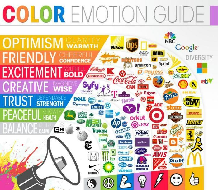
When selecting a main color for a presentation template, take into account the emotions that the content should produce. Is the material meant to excite the audience, rile them up to a new product that changes the game? Use a bright warm color (red, orange, yellow) to capture the energy of your message. If the material is about a trustworthy medical or financial service, use blues to convey reliability and fortitude. For more ideas on the right colors for your content, check out this awesome infographic from The Logo Company on how brand colors speak to our emotions:
 Source: http://thelogocompany.net/blog/infographics/psychology-color-logo-design/
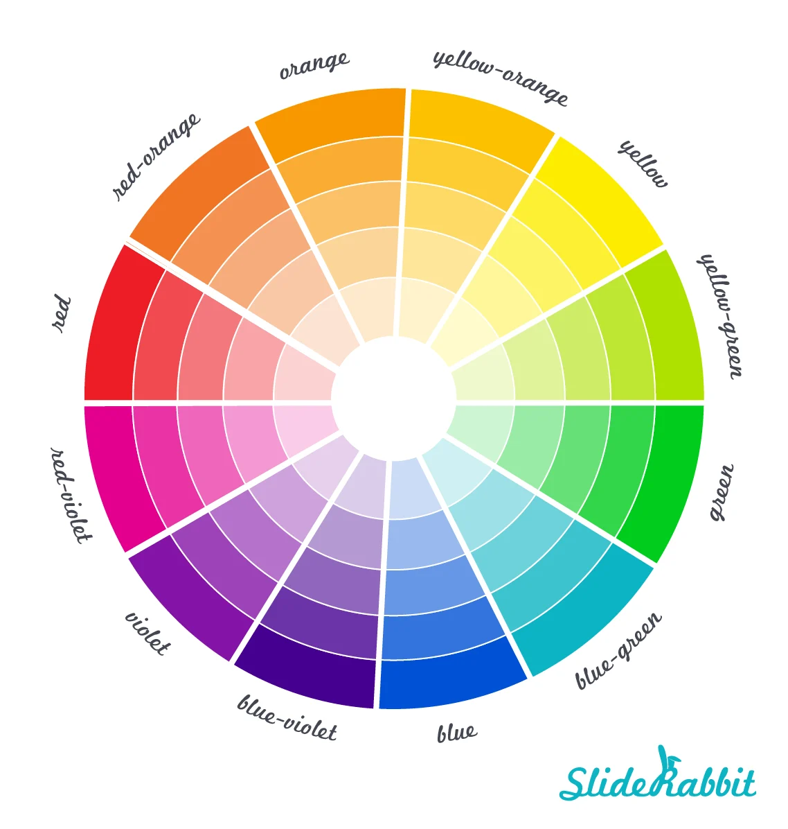
Whether the starting point is a predetermined brand color or a color selected to do some emoting, the next step to building a palette involves color theory. There are several different methods used to combine colors from the color wheel to produce a pleasing look & feel. Here’s a look at the basic color wheel:

Different color combination methods, or harmonies, produce a different feel. Here’s a look at some common harmonies:
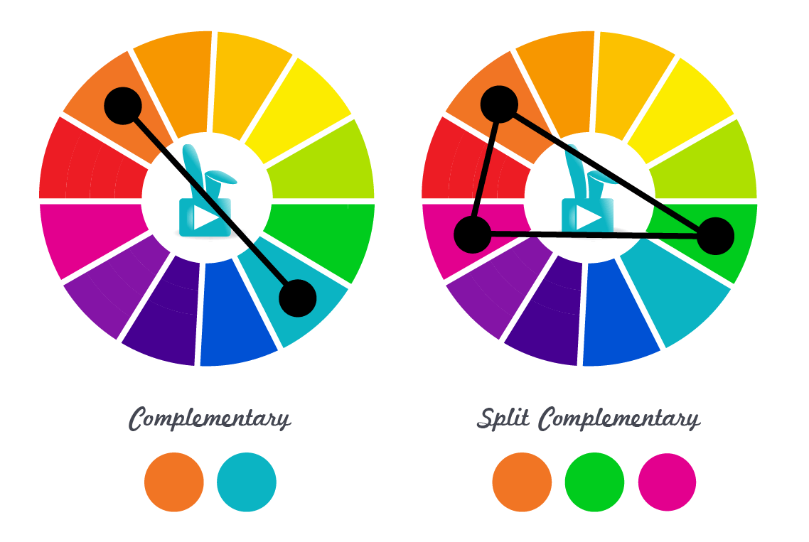
Complementary & Split Complementary color palettes are vibrant and striking. Complementary colors are across the color wheel from each other and provide high contrast.
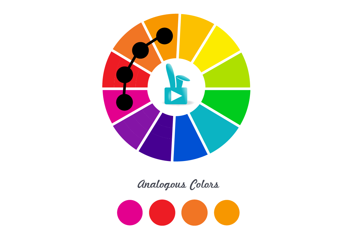
Analogous color palettes are pleasing to the eye and feel comfortable because they often occur in the natural world, like a sunset of pinks, reds and oranges. Analogous colors are next to each other on the color wheel.
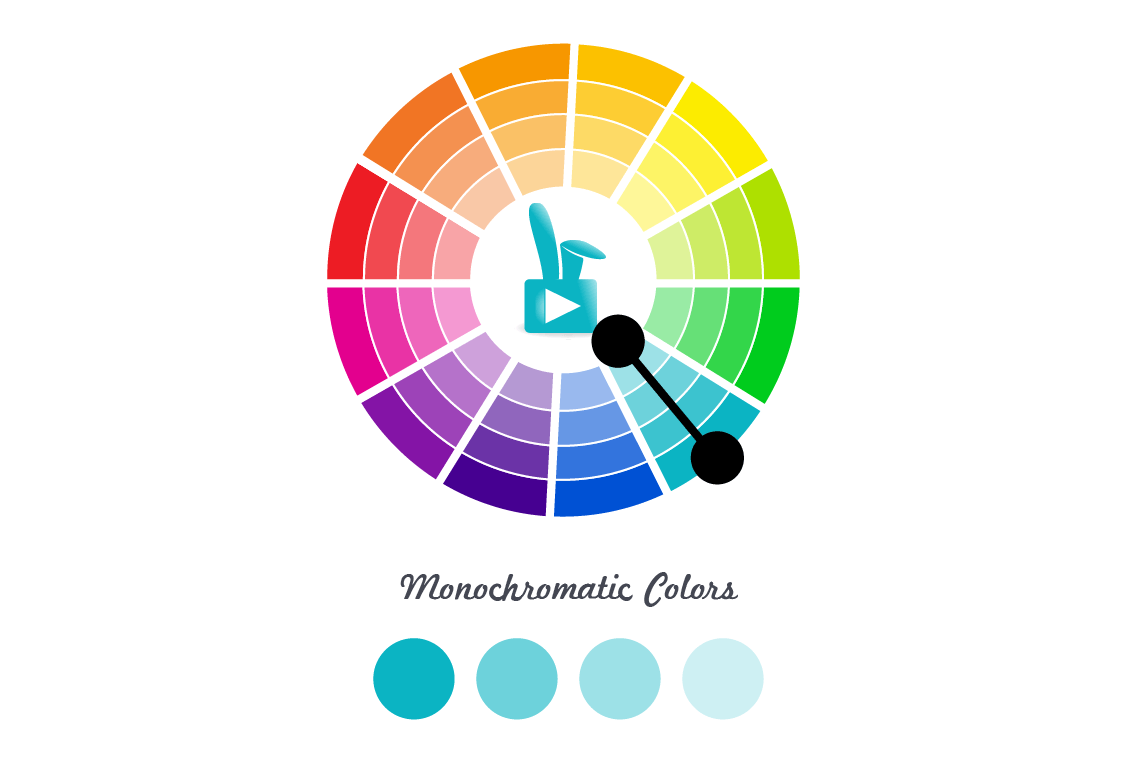
Monochromatic color palettes are built by selecting different saturations of the same color. They feel simple and elegant, but lack contrast.
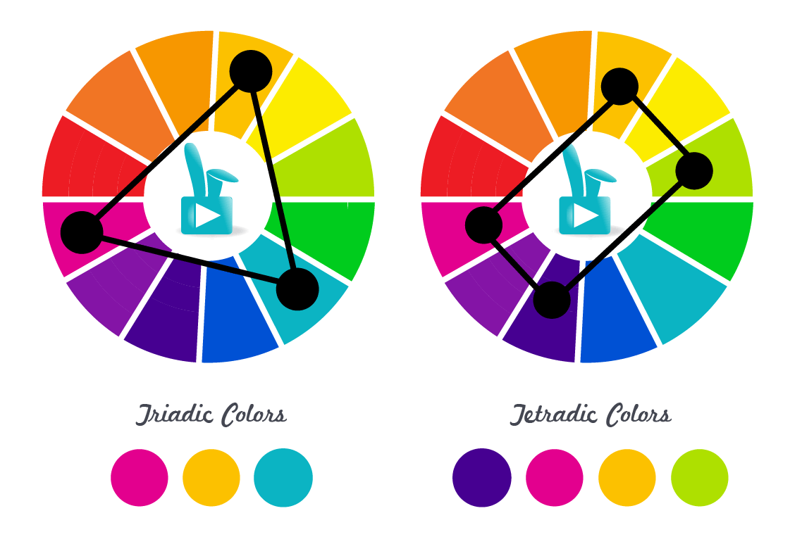
Triadic, Tetradic & Square color palettes use simple geometric shapes (triangle, rectangle & square, respectively) superimposed over the color wheel to determine color harmony. These palettes offer rich contrast.
For quick help selecting the right colors, use an online tool like Adobe Kuler.
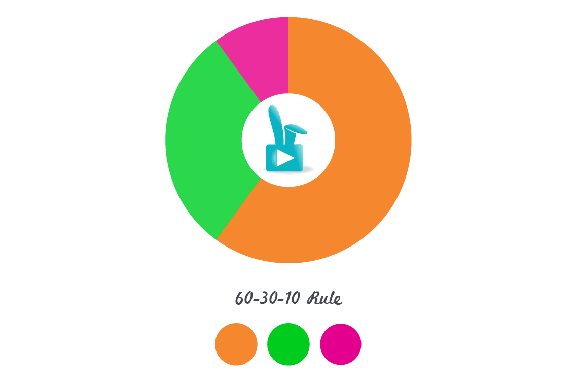
The easiest harmony to execute well is the Split Complementary palette, which is both pleasing to look at and easy to work with. This palette has three main colors, one of which should be dominant. The other two will be used as secondary and tertiary accent colors. Just as we borrowed from photography’s Rule of Thirds for compositional balance, borrow the 60-30-10 Rule from interior design to maintain color balance in the design. Sixty percent of the color on a given slide will be the dominant color – use it for big shapes and common themes. The secondary color should make up about thirty percent of the color, while the tertiary color is used only for small accents to grab attention.
Whether website, marketing collateral or presentation, a good color palette begins to tell the story immediately and subliminally. Evoking emotion through color increases the effectiveness and memorability of the content. Selecting the right color palette for the message and the content is vital to communicating to the audience on both an intellectual and emotional level.
Be sure to connect with us on Twitter or Facebook. Let’s be friends!


Leave A Comment Cancel reply
You must be logged in to post a comment.