Professional Slide Design:
5 Simple Ways to Add Visual Impact to your Slides
Here at SlideRabbit, professional slide design is what we do day in and day out. We love the challenge of taking slides from mediocre to magical. While we hold some of our tricks close to our vests, we’d love to share some favorites with you. Check out these 5 simple changes to bump your slides up to the next level!
1. Go widescreen!
Unless your PowerPoint presentation is specifically for printed handouts or iPad, going to widescreen can be a simple, easy adjustment that will enhance the look of your slides and give you more real estate for content. To adjust this setting open go to File > Page Setup and choose either the default widescreen 16:9 option or type in your custom widescreen dimensions (another common widescreen option is 13.33″x7.5″).

2. Add background images or video
This works particularly well for presentation title slides and section breaks. The effect is strongest when the image is full screen, high resolution and the subject matter is of professional/editorial quality. To achieve this effect quickly, without a lot of cropping and scaling, try adding a full screen image placeholder behind the text boxes in the master slides. If the image is too bright for the text on top to be legible, use PowerPoint’s Picture Correction Options menu to decrease the brightness.


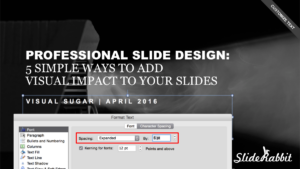
3. Customize Text (character spacing, case settings & fonts)
Using multiple fonts, adjusting case settings (all caps, lowercase, etc.) and adjusting the character spacing of your text will add a custom look to your presentation. To play with this effect in PowerPoint (either in the master slides or on the slide itself), select the text box you wish to adjust, right click, and choose Format Text. Here, under the Font tab, you will see the option to check “All caps” (locking your text box in all caps mode). In the same window, under the Character Spacing tab, you can expand or condense the font kerning (space between the letters). Notice you can see your changes live on the slide as you make your adjustments.
4. Use shapes and lines
Using PowerPoint’s shape and line tool, with colors chosen from your PowerPoint template palette (either a solid color or gradient will work), is a great way to anchor your text, add structure and balance to the slide and help to subtly brand your presentation. This works best if done minimally, the focus should be your content. When adding shapes and lines it helps to first duplicate the slide so that you can compare side by side if it is having the right effect or making the slide too busy.

5. Move content across instead of up and down
We are so used to seeing presentation slide content go from top to bottom that sometimes moving it from left to right is just what you need to freshen up your visual. It’s a simple matter of moving text boxes, adjusting your shapes and lines (if needed) and using PowerPoint’s align tools to make sure your content is correctly centered.

Too busy to fight with PowerPoint? Let us help you shine those slides right up!


Leave A Comment
You must be logged in to post a comment.