Presentation Template Design:
Avoid Branding Overkill
Here at SlideRabbit, we routinely provide presentation template design & development. In fact, nearly every project requires at least some clean up of an existing template… and usually a full overhaul. There are many reasons a template might need a little design tune up, like poor use of space, weak color palette or dated overall appearance. One of the many issues we correct regularly is branding overkill.
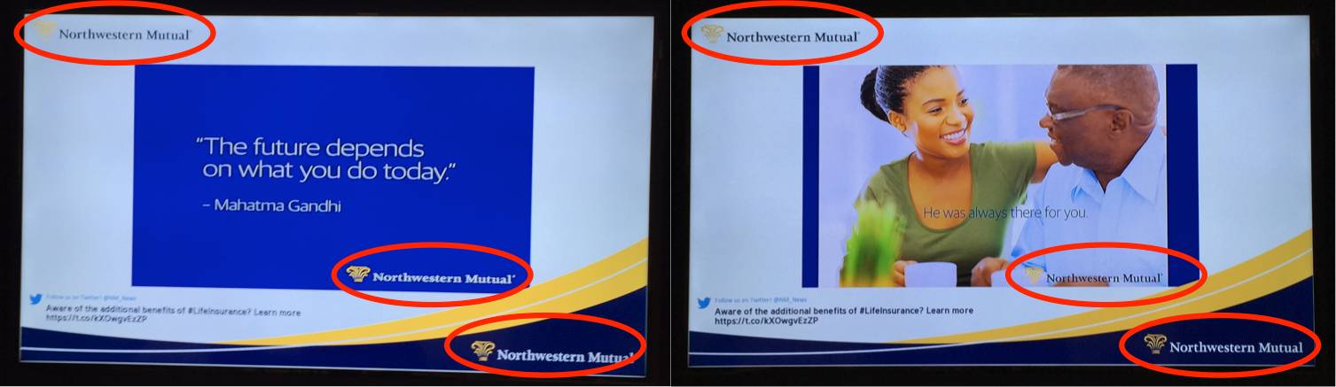
Take, for example, these slides I spotted during a recent visit to a Northwestern Mutual office:

Now, remember, I’m standing *IN* the Northwestern Mutual office. We see a lot of templates that suffer from this same kind of branding overkill from first time clients.
Sure in this instance, they are displaying twitter images, which have a logo. Ok, makes sense. But even if you forgive them that logo, there are TWO more on each slide.
Of course, it makes sense to want to brand your intellectual property, but thinking a little bit more critically about why, when and how you can best use your branding will make for better visuals and more powerful slides.
But branding is good!
Yes, we agree! In this age of the importance of thought leadership, we believe branding every piece of information that you create. Your ideas should be recognizable and easily associated with your brand. But now that customers have come to recognize brands through even subtle cues, more obvious marks can sometimes be unnecessary. And because logo marks take up space, there is a strategy to when and how much to use them. Sometimes subtler branding will suffice.
When to Use Your Logo? (And When to Not.)
So if every piece that your company creates for public consumption should be branded, how branded should it be? Well this depends on how a certain piece will be disseminated.
Will this deck be presented to a potential client in an one-on-one setting? Then you don’t need a logo on every slide. They wont forget who you are in the span of an hour. Pop a logo on the first slide and the last, and remove logos from each slide in between. Removing these extraneous logos gives more room for your content, instead of using space for something your audience will become habituated to very quickly.
Is someone from your company presenting at a conference? Think about the setting – will they be wearing a company shirt? Will the podium or the area have your company name presented clearly? Or will they be one in a sea of speakers, where it would be easy to forget just who is speaking? Make a call on logo usage based on the environment.
Are you distributing a deck or images online via SlideShare or social media? Pop that logo and company name on every slide. Information distributed on the web is made to have legs – so make sure your brand travels with it.
How Does this Affect your Presentation Template Design?
Using subtle branding and visual cues will suffice for most uses of slides. Your private audiences already know who they are listening to, so don’t waste precious visual space by hitting them over the head with it. Removing logos & wordmarks from your headers & footers will open up your design and make it feel lighter and more modern.
For those uses where your slides may be shared and seen out of context, its important that your branding be on each slide. One brand mark on each slide will suffice – there’s never a need for two like Northwestern Mutual!
Several of our clients have started to keep two versions of their presentation template, one for private uses of their slides and one for more public applications. Need help cleaning up your templates and rethinking your visual approach? We’re here to help!


Leave A Comment
You must be logged in to post a comment.