Typography 101: Tips from a PowerPoint Designer
Let’s talk typography. In presentation design, well-designed text helps get your point across in an aesthetically pleasing and attention grabbing way.* There are many considerations when it comes to typography: colors, spacing, font, kerning, size, etc. Below are a few typography tips from a SlideRabbit PowerPoint designer.
*But shouldn’t we reduce text? Yes! Especially for live presentations. For self guided presentations, you may need more text to clearly communicate the concepts. Learn more about using text in presentations correctly.
Color
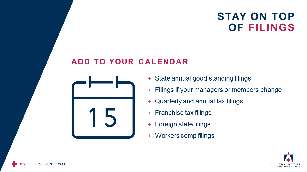
Text color is crucial. Pick contrasting colors in your slides so that the type stands out to the viewer, even those at the back of the room. As seen in the slide below, SlideRabbit selected the client’s boldest brand colors. These colors are easily readable on a white background.
Color can also be used to add emphasis to some text over others. The red type highlights important information, drawing the viewer’s eye. Highlighting and emphasizing text helps the audience focus on the main ideas.

AANE Client Slide
Spacing
Nobody enjoys seeing a big chunk of text. “Walls of text” exhaust the viewer’s eye and make it less likely that the text will be read. It is important to let text “breathe.”
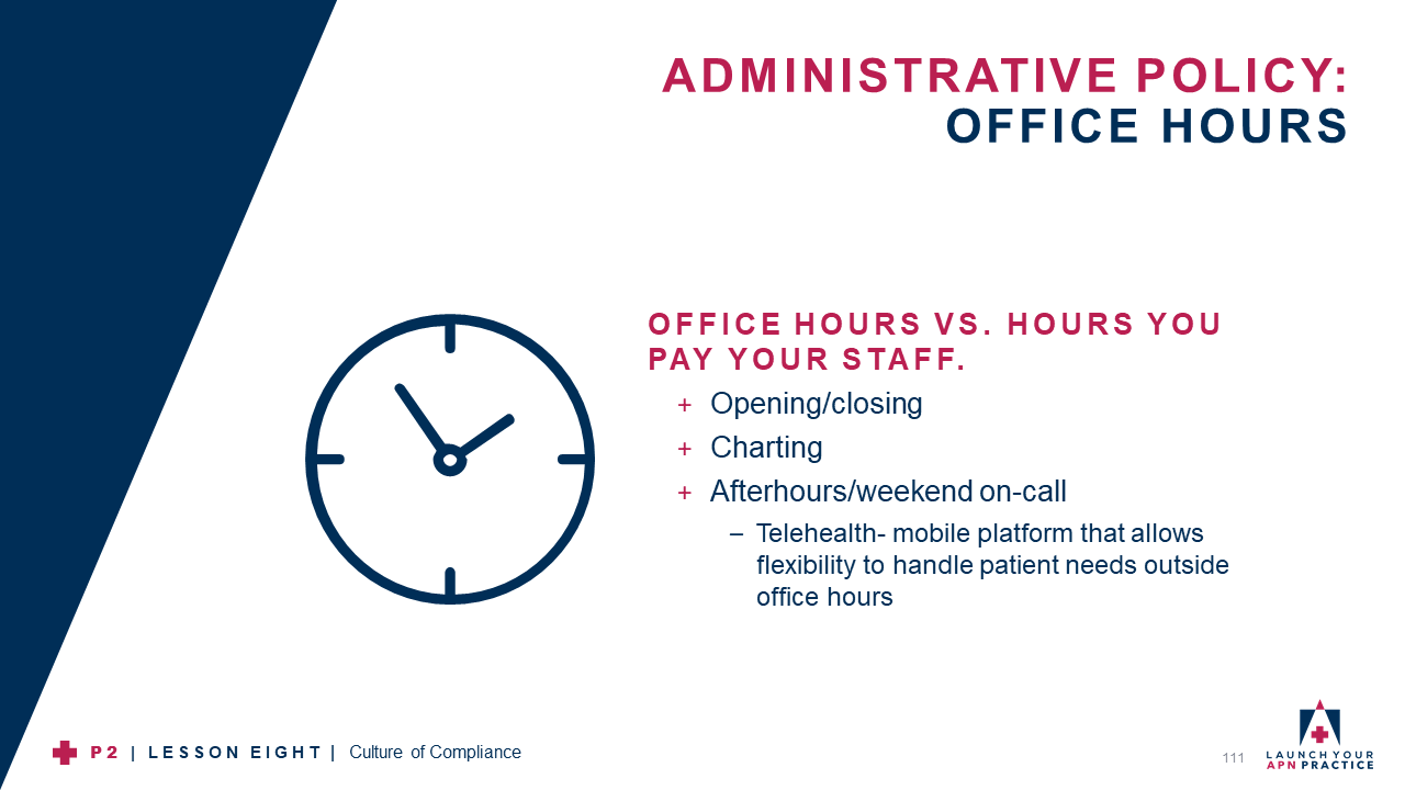
Add extra space between the lines to create white space for the viewer’s eye to rest. On the slide below, a healthy amount of space between each bullet point makes the text more inviting to read.
Well-executed line spacing creates professional and polished slides. Don’t forget to make the spacing consistent!
AANE Client Slide
Font
Fancy fonts can be tempting for their uniqueness. However, they can be hard to read and detract from the general aesthetic of your presentation.
As mentioned in a previous blog, it is typically best to stick with a standard font. The slide below is using a standard, san-serif font.
San-serif fonts look clean and are easy to read. For a little flair, pair a san-serif with a serif, but use it sparingly! When it comes to choosing the typeface, simpler is always better.
AANE Client Slide
Want to learn more tips? Contact us now!


Leave A Comment Cancel reply
You must be logged in to post a comment.