The Slides of the Union:
The Presidential Presentation Graphics of 2016
 Here at SlideRabbit we are always so pleased to see visual communication, and especially presentation graphics, in the news. Last year we were excited to see the White House using attractive and powerful slides in the 2015 State of the Union, we even wrote them up!
So you can image our excitement as SOTU16 approached. This year’s slides are a little less moving; I guess someone has been more busy legislating.
Let’s take a look at what the State of the Union brought us in the way of presentation graphics this year.
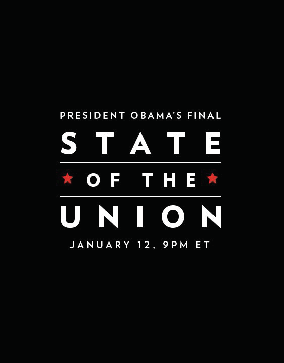
 The Aspirational Image

We are big proponents of “less [words] is more.” The aspirational image slide provides an emotion-provoking backdrop for parts of a presentation where the ideas delivered by the speaker need to trump what is on the screen. Although allowing the spoken word to take precedence, the aspirational image slide bolsters the statements and provides an emotional connection with the content.
This aspirational image slide works particularly well as Obama’s silhouette is so recognizable. He uses this image to discuss a recommitment to the space program, which makes it even more poignant.
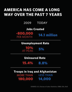 Winning Numbers

We love a good winning numbers slide. Using real, tangible proof in your presentations is a lot more persuasive, so we encourage clients to go the extra mile on research to find the number to support their claims.
As much as we love a good numbers slide, this one feels like a bit of a missed opportunity. When you take the time to read each line, the stats are pretty compelling. Why not give each pair of stats their own slide? Show the change in created jobs in a positive/negative bar graph. Show the 90% reduction of troops on the ground in its own infographic.
These points seem to merit separate slides with visually compelling illustrations.
 Color-Themed Sections
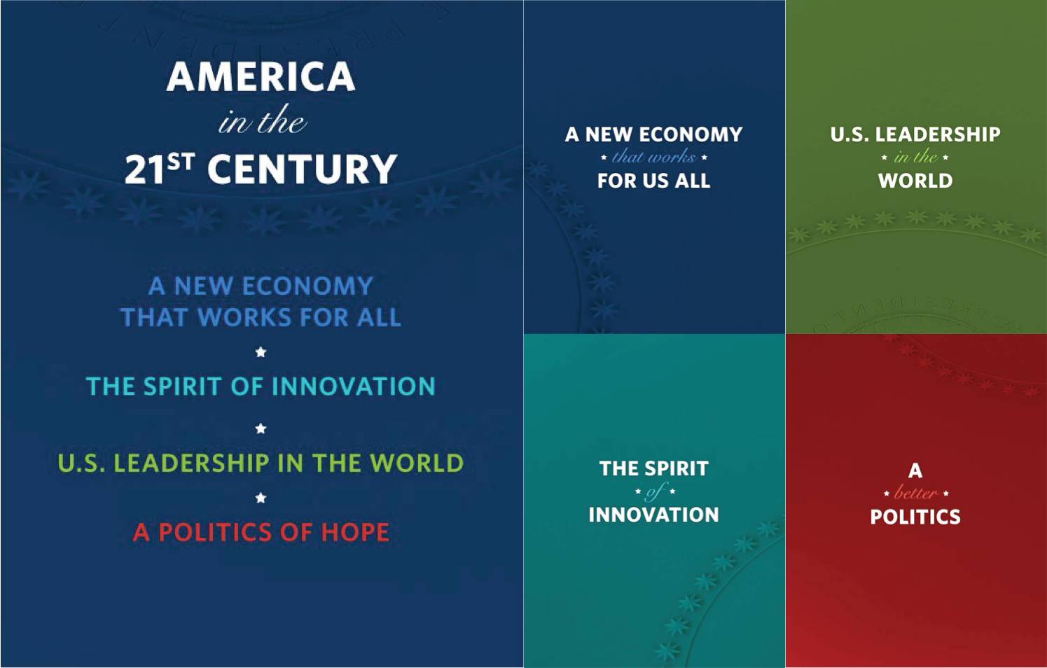
This year’s State of the Union used a color-coded agenda slide to introduce the major sections of the presentation. Each section introduction slide, then, matched in color theme to the agenda. Some slides in each section also used the theme color.
This tactic can be really helpful when organizing information and creating visual cues for your audience. However, the colors feel a little unmatched from the agenda slides to the section breaks and the use of color within the sections was a little inconsistent.
We like the tactic but think the execution could have been a little cleaner and more complete.
Overall, we’re so glad to see the highest office in the land employing visual communication in their addresses. Presentation graphics make information quicker to digest and easier to remember. Persuasive presentations in particular benefit from the illustration of proof; seeing is believing.
Want to see what SlideRabbit can do for your next presentation? Check out our portfolio!


Leave A Comment
You must be logged in to post a comment.