Presentation Slide Design:
How To Prune Your Text
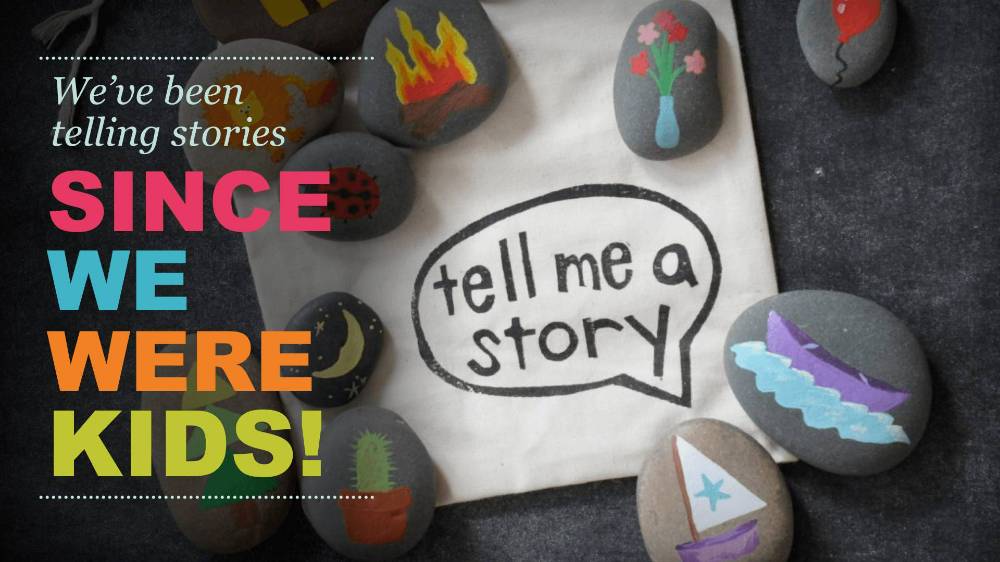
We recently had a great time teaching presentation slide design theory and practice at the Colorado Non-Profit Association‘s Technology Summit. Our course, Slide Diets: Design Tricks to Slim Down Your Content, focused on creating more impactful slides. We’ll be covering some of our tips here on Visual Sugar. We’ll start with how to reduce text to make better slides.
Why is Reducing Text Important?
Your audience cannot read and listen at the same time. We are visual creatures, so our brains prioritize sight over hearing. This means your audience is reading your slide as you’re talking through your points. We read faster than we talk, so when they finish and tune back into you, you’re going over information they’ve already read. Instant glassy-eyed boredom ensues and you’ve lost your audience… to your own slides.
So how do we take back control of our presentation? By taking a more discerning editors pen to your content, you can better communicate with your audience and keep their attention. We call this process text pruning: reducing words without losing meaning.
How to Prune Text Without Losing Meaning
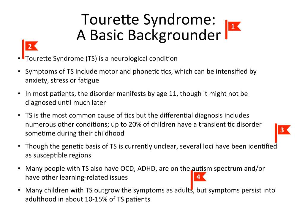
Here is a typical client text-heavy slide:
click to enlarge
This slide commits some pretty serious transgressions against presentation slide design. Of course, it’s all text and it’s several points on one slide. But it’s not possible to create ideal slides at all times for every presentation.
So if we did need all this text on one slide, how could we trim down the content so that it is more impactful?
As we reviewed earlier, this is all about reducing the text as much as possible. We want to move from spoken or written style language, to presentation style. The text should be boiled down to its leanest and most direct form. Here are a few of the red flags we look for to find text that can be pruned.
Obviousness
click to enlarge
Obvious information is the first to trim from your slides. See Red Flag 1: this is clearly a background information slide. There is no need to take space up in the title with this unnecessary clarifier.
Redundancy
Now that we’ve removed the extraneous information, our title is “Tourette Syndrome.” Yet, as you look at Red Flag 2 and through the rest of the bullets, you’ll see the syndrome named another 7 times. This kind of redundancy is a good indicator that there is some pruning to be done.
Written/Spoken Language
A lot of the wordiness we see in slides, ends up in there because people write their slides as they would a script. When we write that way, unnecessary connectors and qualifiers sneak into the bullets. Red Flag 3 shows a wordy approach to a simple concept. See the after below for the “presentation writing” version of this information.
Inferable Information
At Red Flag 4, we see one of the sneakiest, text-heavy offenders. When you’re writing the presentation all this information might seem important to note. But remember, you’ll be up there to explain the result or impact of your facts. The fact here is that “symptoms persist into adulthood for 10 – 15% of patients.” That means that “many” (85 – 90%) of affected children outgrow it. Don’t crowd up you slides with information that is easily inferable
Final Product

click to enlarge
Here’s the final text for our slide. We’ve trimmed out about half the words without losing any of our information!
We’ve boiled down our wordiness to informational phrases only. This slide is now ready to go into the design process, where we can add visual interest.
There are several design tricks to make basic text more memorable and impactful. We’ll cover a few of those next time!
Have you ever caught yourself making that “before” slide example? It’s a lot more common than you’d think! We’d love to help you prune your text and create more impactful slides. Presentation slide design and refinement is what we love. Drop us a line!


Leave A Comment
You must be logged in to post a comment.