3 Quick Slide Design Improvements
Suddenly working from home highlights how much information we usually share face-to-face in the office. With a captive and in-person audience, we can keep attention focused. From home, attentions tend to wander.
Quality slide design is essential for conveying important information virtually. It’s tempting to throw a ton of information onto slides, but you should hone your messaging and use design tactics so that your messages are immediately clear to your distracted audience.
Remove overly verbose text wherever you can. Improve the appearance of necessary text with some eye-friendly tactics, below.
Here at SlideRabbit, we have many slide design tricks for dealing with text-heavy slides. These tricks help increase visual interest without losing information. We understand that many of you are designing slides for the first time and may be in a time crunch, so below are some quick and easy tricks to help step up your slide design.
3 quick & easy slide design tactics
Icons
A simple way for any non-designer to add visual interest to a list is to include icons. Icons are wonderful memory and comprehension triggers for the audience. PowerPoint has a full library of icons to use, or you can search thenounproject.com for additional options.
To further increase visual interest, consider adding a color-block background and changing the icons and text to white.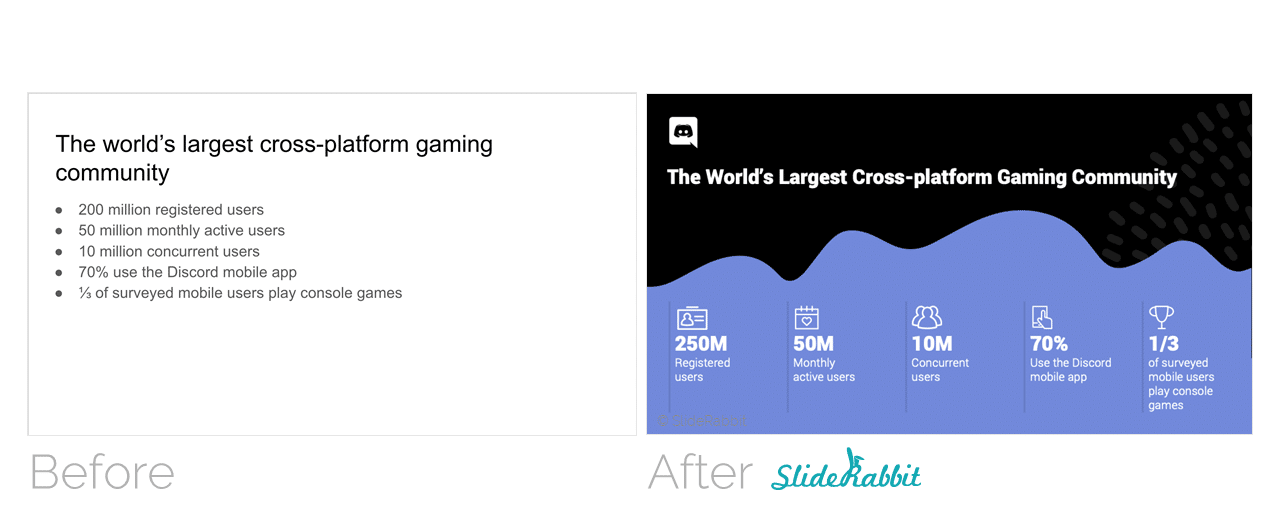
Chunking
“Chunking” your text into shorter width blurbs makes them easier to read. The shorter width chunks also allow for more creative layout options.
Using text emphasis, like bold, to indicate the most important words or phrases will help your audience understand your content more quickly.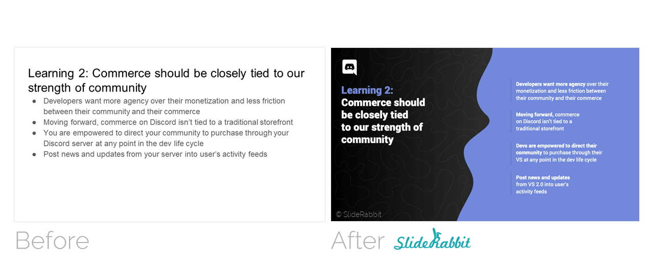
Path
An ordered array of information can be displayed on a journey layout. A clear path helps guide the audiences to form associations and inferences from direction and flow. In addition to order placement, arrows are an easy way to guide your audience’s attention in the right direction.
Use text emphasis here as well, like highlight, to indicate the most important step(s) or the target outcome, keeping your audience focused on the journey’s goal. 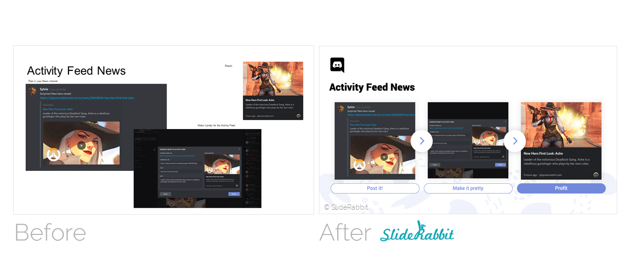
Need more help?
SlideRabbit can offer solutions to text-heavy content as we did for Discord App in the above examples. In this case, we developed a brand new look and feel for this client, custom to their brand requirements and client goals.
No budget for a full design overhaul?
We also offer light clean up services.
Many clients come to us with smaller needs, like consistency issues or just slight design facelifts. If you don’t already have a look and feel or template established, we can work with what you have or design into a variety of standard template designs to choose from. These services are perfect for clients who are tight on budget or time.
We are happy to help with your design needs, whatever they may be. Drop us a line!



Leave A Comment
You must be logged in to post a comment.