5 Signs of a Perfectly Built PowerPoint Template
Here at SlideRabbit we are expert PowerPoint template builders. Unfortunately, many other template sources have little to no knowledge of the intricacies of template building. If you want a template that functions correctly and actually makes your life easier, be sure to get your template from an agency specializing in presentation design specifically.
If your PowerPoint Template doesn’t have these 5 things, it’s time for an upgrade:
Brand colors & fonts set into the theme
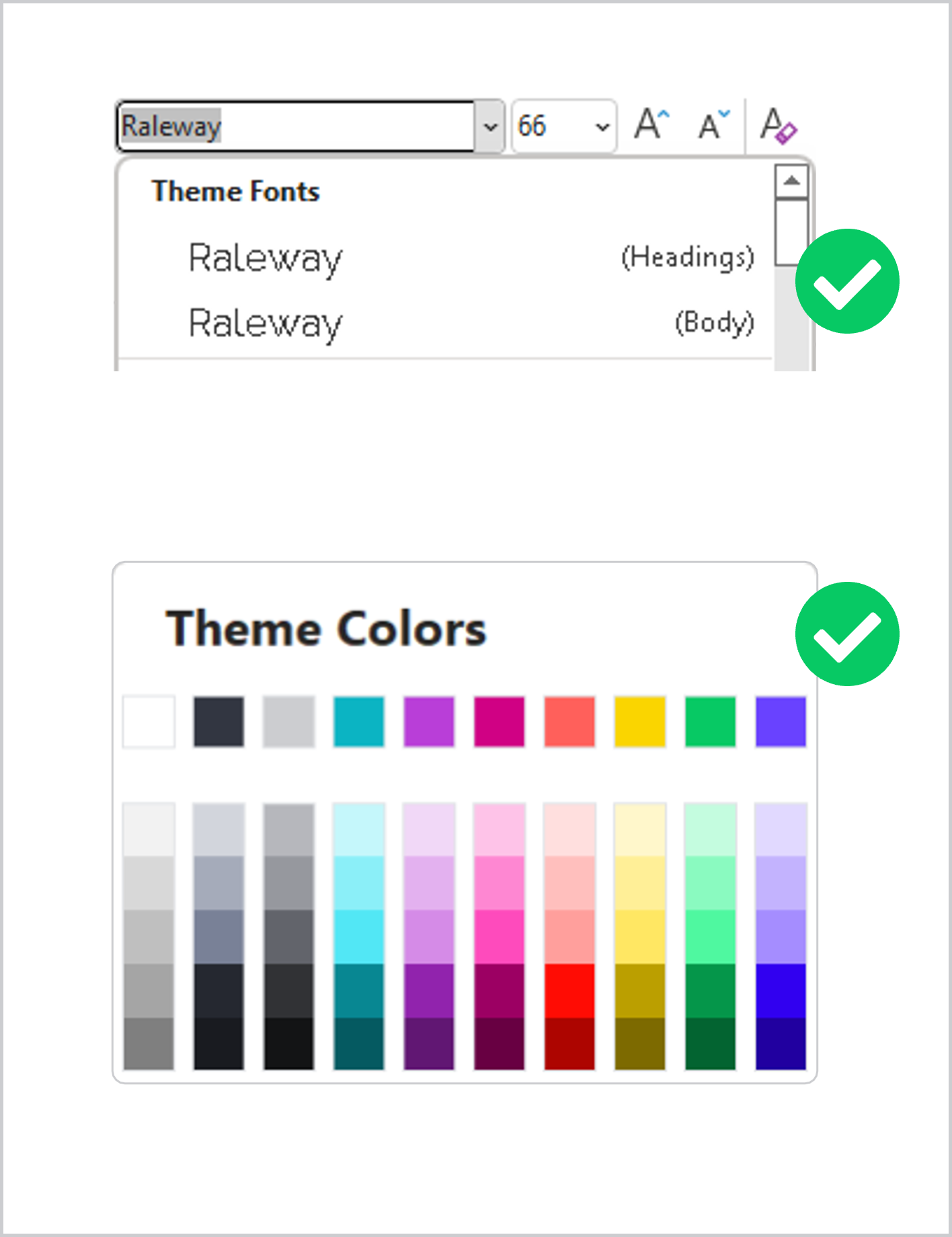
Does your template have your fonts set as your theme fonts? What about your colors? If the theme row in the fill palette isn’t your brand color palette, your template has not been set up to give you the best head start it can. If your fonts are not set as theme fonts, meaning they appear with parens (Headings) or (Body), your template was not created properly.
Only one master set
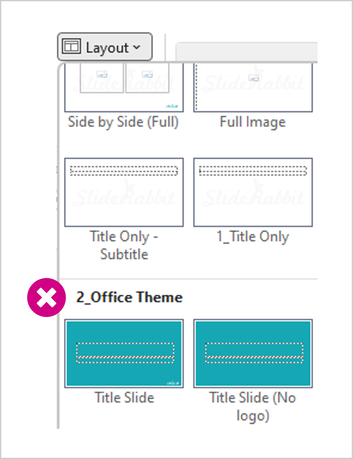
When you drop down your layout selector, do you see multiple master sets? If so, you should not trust your template to be consistent. Each of those families might have different fonts or colors set. They could use different placements for important stable placeholders.
All the original default layouts
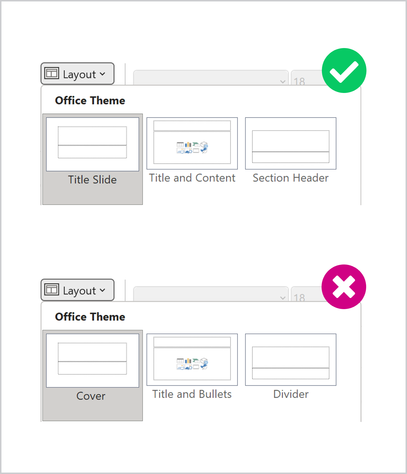
Did you know that the original default layouts should never be removed or renamed? Doing so means that templates cannot automate the transfer of slides the way they should. If your PowerPoint template has non-standard layout names for these default layouts, it cannot intake and reformat slides from other templates properly.
A little more technical, but extremely important, is that your parent layout has all the default placeholders. If any of these have been deleted they will not function correctly throughout the template, even if added back. The underlying code is broken.
Cohesively designed layouts
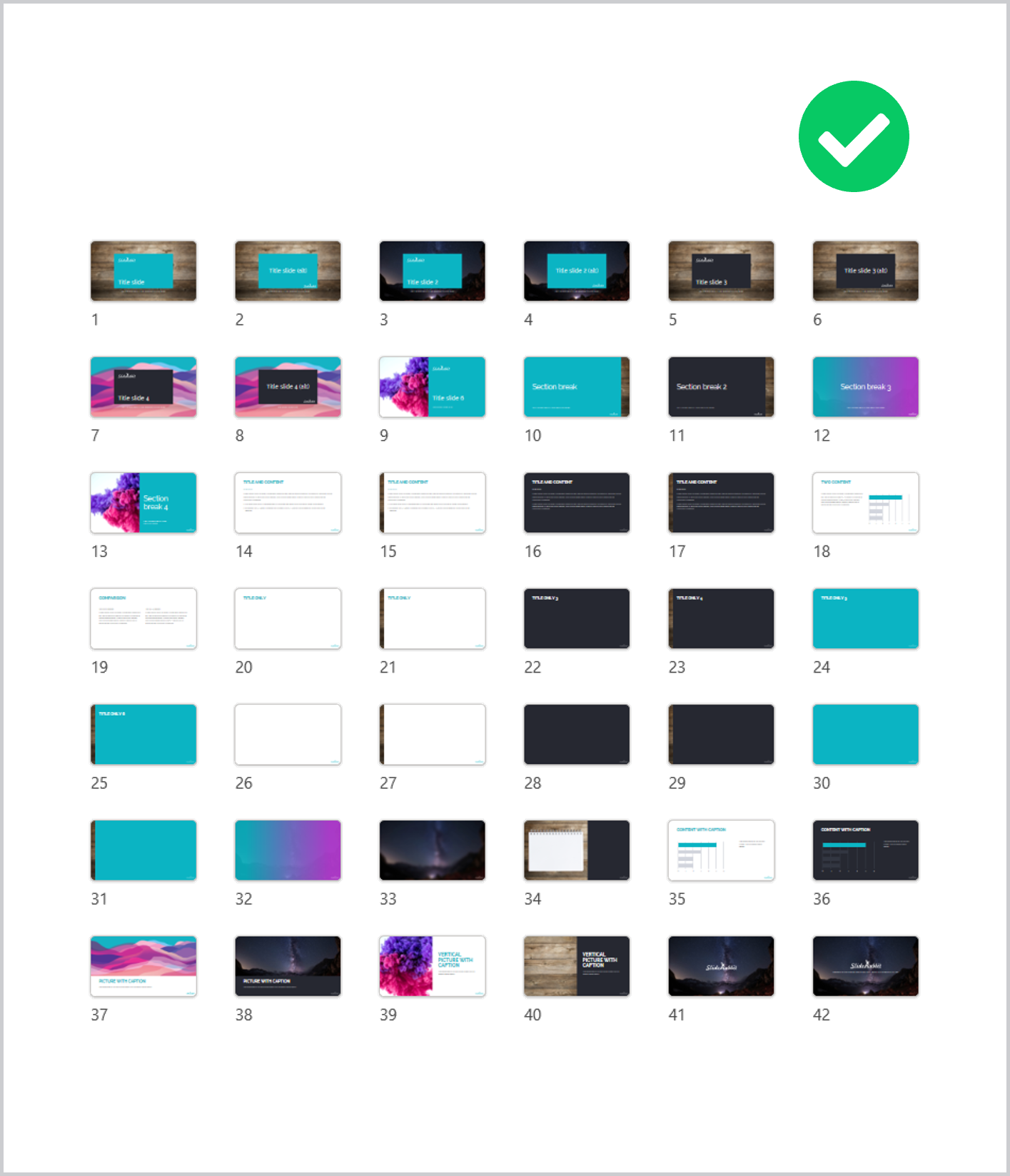
While you want variation in your layouts, they all need to be cohesively designed so that the end product will look professional and polished. Do the same shapes and design elements recur in interesting ways? Are your titles always in the exact same spot? What about the content horizon for each layout? While design elements may move from slide to slide, keeping your content elements in consistent places will ensure that the audience doesn’t have to deal with jumping titles or other jarring layout changes.
Asset and guidance slides
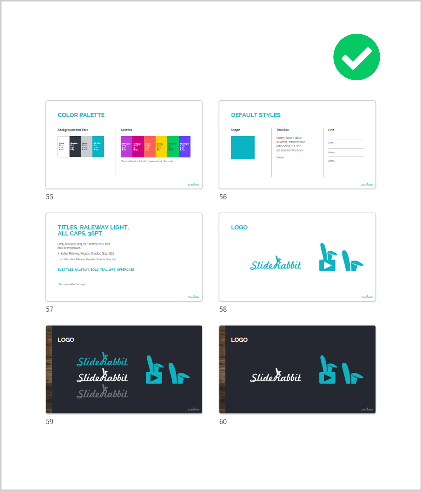
Do you have a set of matching icons that are native PowerPoint shapes? How about style guide slides? Providing your team with everything they might need in the template will increase efficiency and keep design more consistent across different presentation producers.
Need a new PowerPoint Template?
Did your template pass the test? Supplying your team with a perfect PowerPoint template supports them in making higher quality presentations, using less of their precious time.
If not, drop us a line. We can do a full functional audit and rebuild your template so that it can actually be an asset to you.
Further reading:
If you are designing templates and some of the above caught you by surprise, may we recommend this instructional book by Echo Swinford and Julie Terberg. It’s an incredible resource for template building.


Leave A Comment
You must be logged in to post a comment.