5 Red Flags to Look for When Reducing Text on Slides
Here at SlideRabbit, a lot of our clients are interested in reducing text on their slides. We offer text simplification as a service and we also offer a workshop, SlideDiets, specifically geared toward this skill. But there are some fundamentals we’re more than happy to share. Read below for five red flags to help you spot text that needs to be trimmed.
Why is it important to reduce your text?
You’ve probably heard it often – “Only a few words on each slide!”
But why?
The long and short of it is, people cannot read and listen at the same time. Your audience will default to reading text on the slides, tuning you out. Since they can read faster than you can talk, by the time they tune back in, you’re going over old news. Cue glassy eyes and text message-checking.
Hold your audience’s attention by using your slides to support what you are saying, rather than repeat it.
Feel naked without your ideas on your slides? Use the text on your slides as prompts, rather than script. The presentation will feel more natural and engaging to the audience
How does one write for presentation?
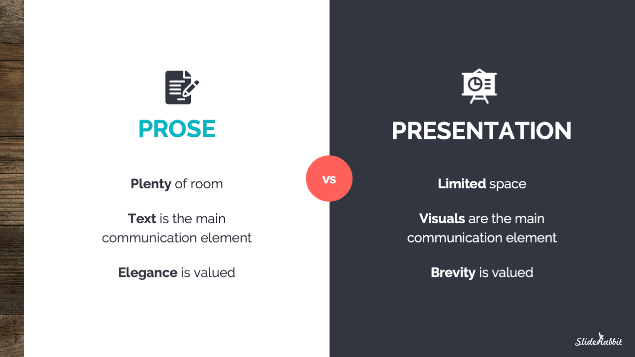
We are all accustomed to writing in prose style. It’s comfortable to write this way when you’re writing a presentation, but it’s the wrong approach.
Instead of opening PowerPoint right away, consider writing out a script or outline in Word. Then re-read, looking for places to visualize those ideas and main points.
Once you move into slides, bring only the very core concepts over in text. Here’s a look at the differences between prose and presentation-geared writing:

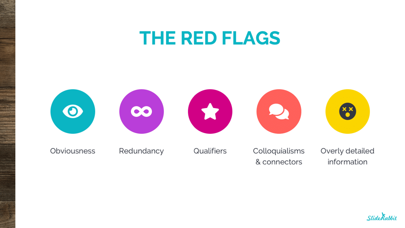
What are the five red flags to look for when reducing text?
If you’ve already written your presentation, go back and look at your slides with an editor’s eye. If you see any of the below red flags, there’s a good chance that you can further simplify your text. Remember, the more concise your text, the more you’ll be able to hold the attention of your audience.

Obviousness: Look for places where you’re stating things that can easily be surmised from other information. Avoid obvious titles like “Financial Report” and instead, use your titles to state your conclusion or argument. “2019 Numbers Show a Need for Increased Investment,” for instance.
Redundancy: Examine your text for repetitious phrases or ideas. If you’re using the same word over and over, chances are you can streamline the ideas and condense the text. Watch for over-labeling on graphs & diagrams, as well.
Qualifiers: If you see phrases and words like “in most cases” or “somewhat” popping up on your slides, you have room to remove more text. These terms belong in your talk track, not on the slide. Keep only the core concepts on the slide, and use concise language.
Colloquialisms & connectors: If you are using colloquialisms, it’s likely that your text is not succinct enough. If you are using a lot of “and”- or “however”-like terms connecting ideas, you’re writing in prose style. Simplify the language.
Overly-detailed information: Details may feel crucial, but they will only clutter up the main information on your slide. Share details orally or in handouts; reserve slide real estate for only the most core ideas.
Our workshops include review of your slides and a customized curriculum tailored to your needs. We cover more tactics like this to help you make better slides. Interested? Drop us a line!
Want more how tos? Sign up for our newsletter to keep up to date with our blog posts and other SlideRabbit offers.


Leave A Comment
You must be logged in to post a comment.