Text-Heavy Presentation Design
Project Description
Case Study: Capturing Prospects with a Memorable, Text-Heavy Presentation Design
Client Challenge:
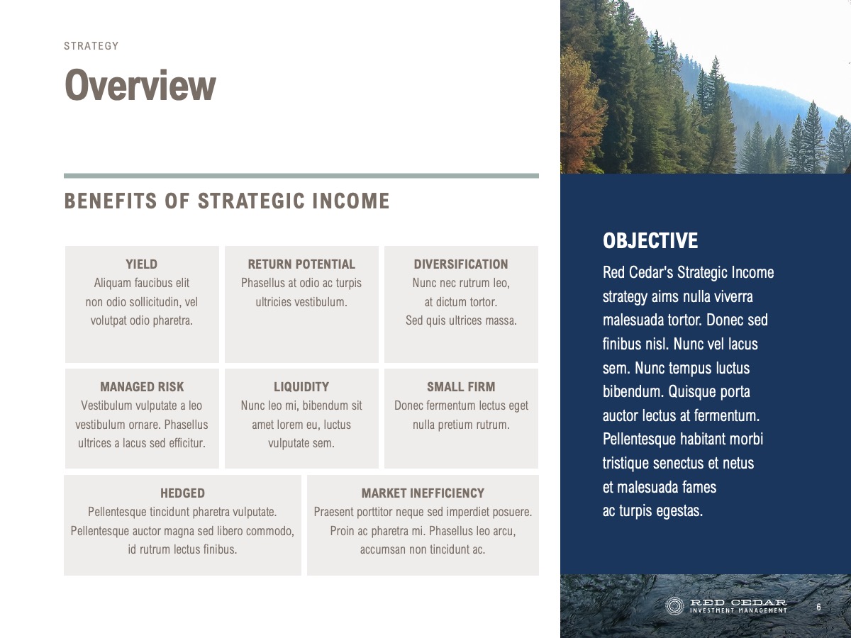
Not every presentation can obey the 6×6 rule! Red Cedar Investment Management, a firm known for its sustainable and client-focused approach, approached SlideRabbit with a common challenge. They needed a handout presentation to send to prospects after initial pitch conversations—a tool that would serve as a standalone piece to reinforce key points, provide additional context, and encourage further engagement. This deck required a different approach than a typical, highly visual pitch presentation. It needed more text-heavy presentation design to convey detailed information, yet visually engaging and distinctly aligned with the Red Cedar brand.
Our Solution:
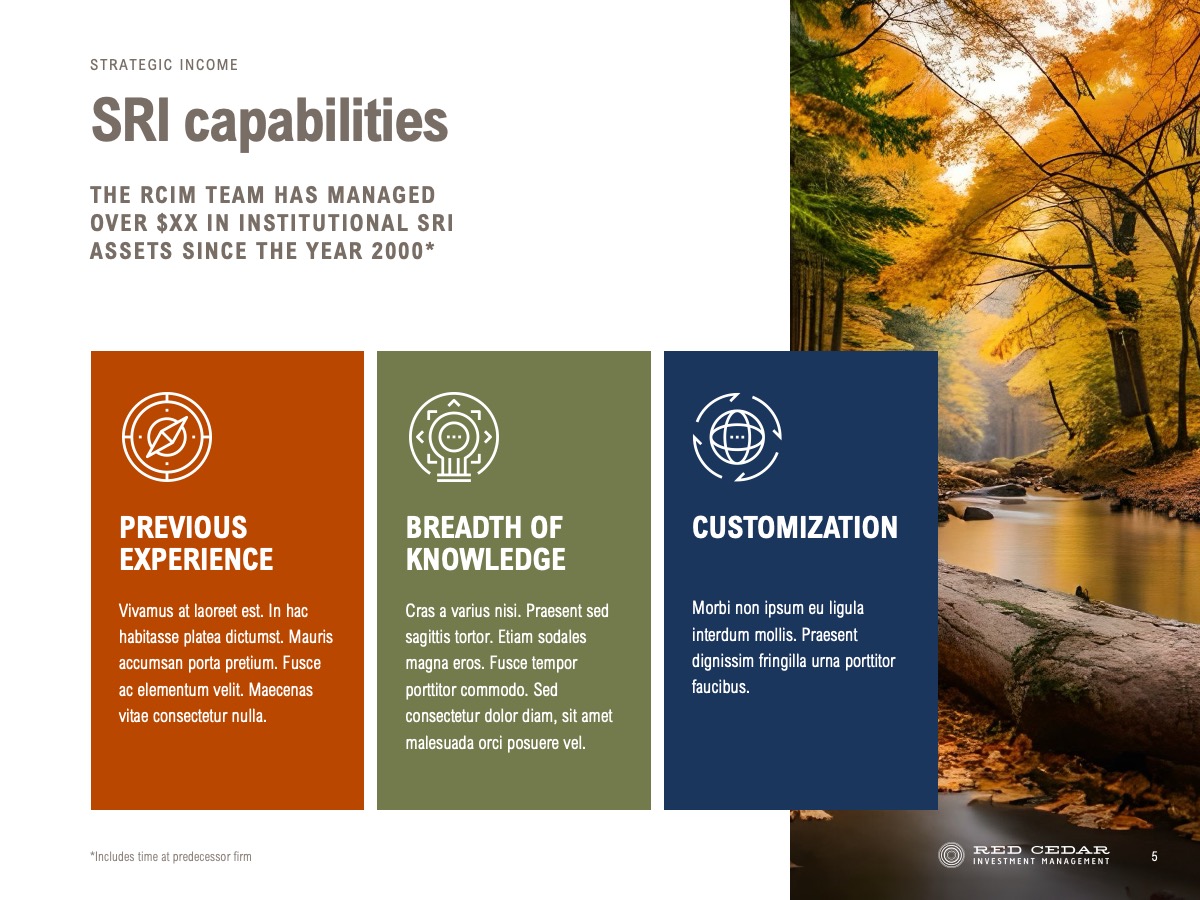
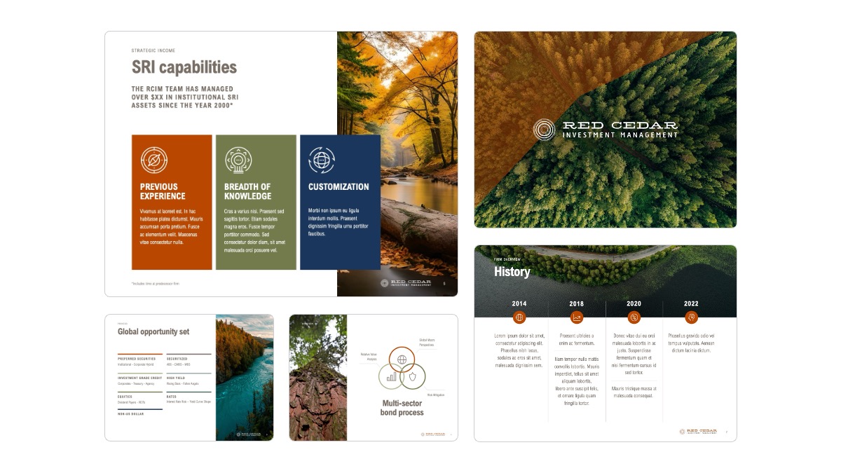
Understanding the need for a balance between readability and aesthetics, our team crafted a polished, content-heavy handout that stayed true to Red Cedar’s brand and values. The primary focus was on delivering a piece that could act as an effective follow-up to in-person conversations, highlighting core company information in a way that was easy to read, digest, and remember. The layout was structured to guide the reader naturally, with each slide functioning almost like a page in a brochure, making sure it could stand alone without additional commentary.
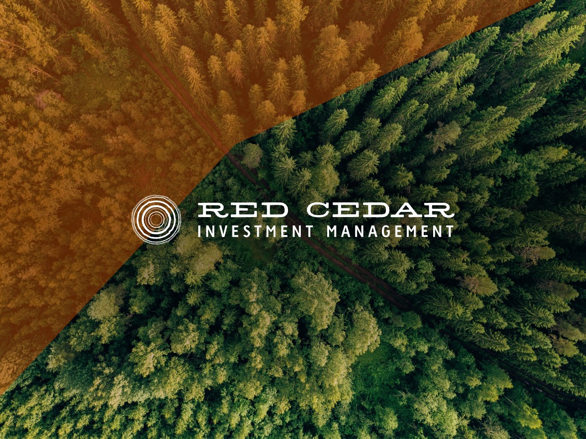
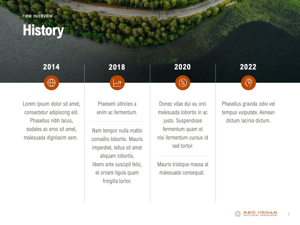
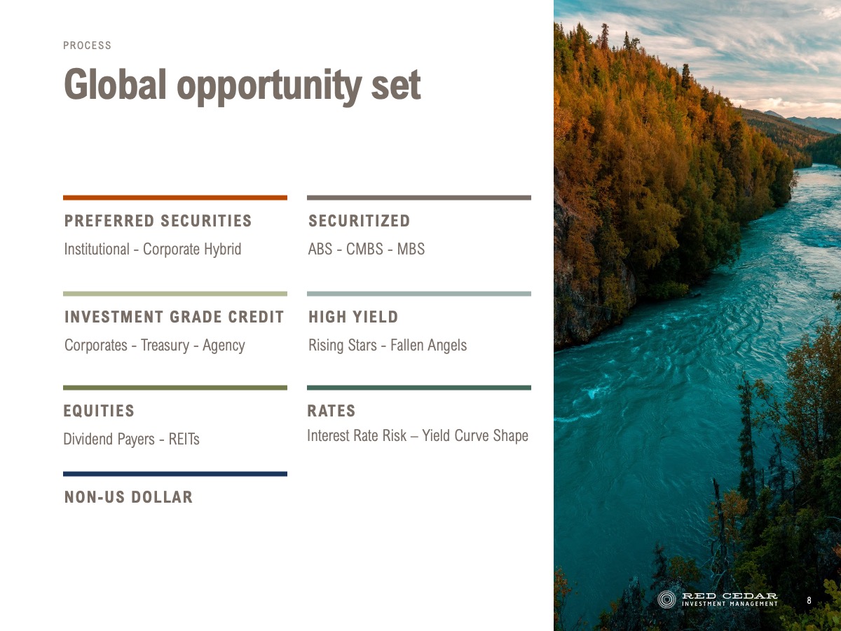
To capture Red Cedar’s brand essence, we wove in subtle nature imagery throughout the deck, echoing the client’s sustainable investment philosophy and bringing a unique touch that distinguished their materials from competitors. Images of forests, rivers, and green landscapes served as understated background visuals that didn’t overpower the text but instead provided a cohesive, polished feel. Each slide was carefully designed to balance text density with open spaces, ensuring readability and allowing the visuals to breathe.
The Design Strategy:
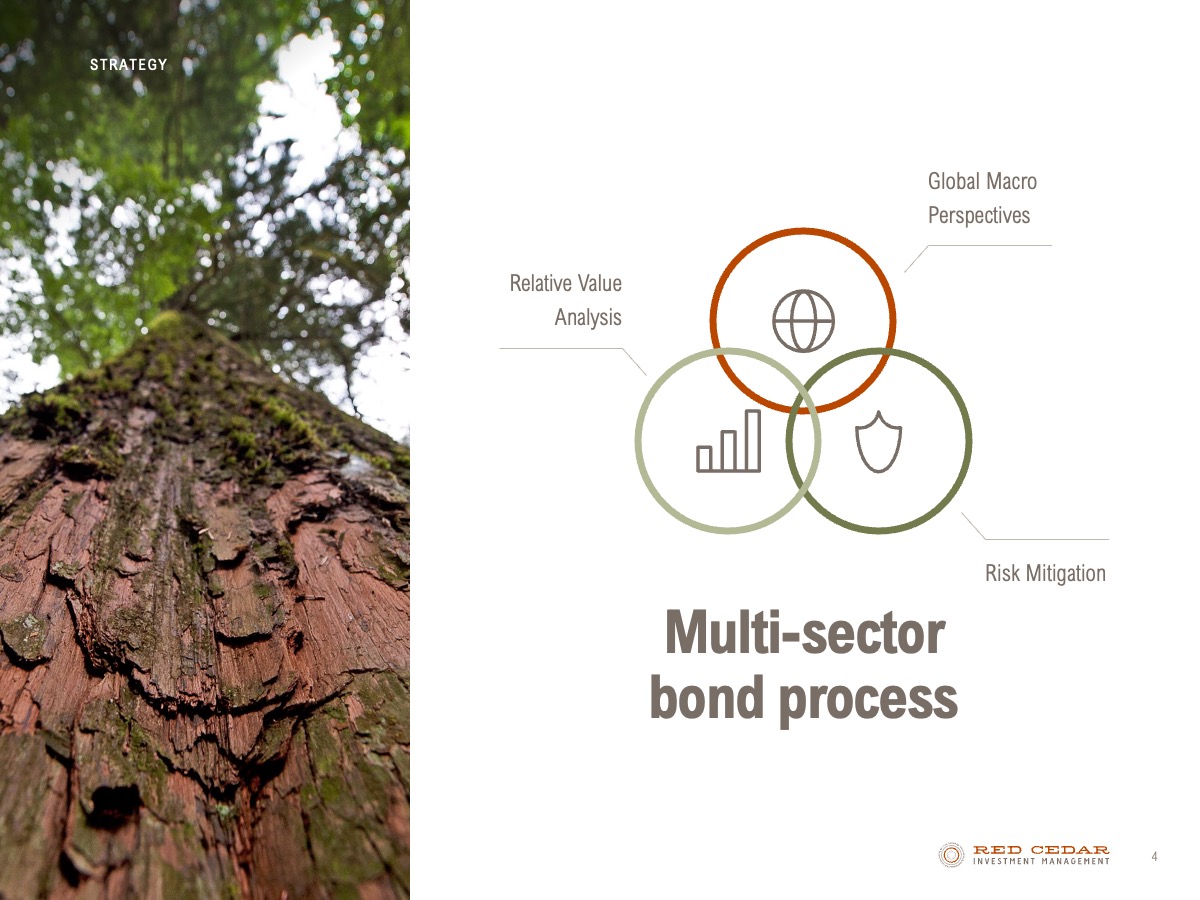
Typography and color choices were key to maintaining the sleek and professional look Red Cedar wanted. We used clean, modern fonts and an earth-toned color palette that felt sophisticated and tied back to nature. Sections were organized into concise text blocks and headers, allowing readers to quickly grasp important information without feeling overwhelmed. Additionally, we integrated icons and graphic elements to break up longer sections of text and add visual interest while still prioritizing a clean and uncluttered aesthetic.
Results:
The final product was a refined, professional handout that presented Red Cedar’s values and expertise with clarity and appeal. Feedback from Red Cedar was overwhelmingly positive, with clients noting that the presentation effectively communicated their unique offerings and left a lasting impression on prospects. This project highlights SlideRabbit’s ability to deliver tailored, brand-focused materials through text-heavy presentation design while upholding our commitment to aesthetic quality and effective communication.


