As our first full year in business comes to a close, we’re looking back and celebrating the victories, learning from the challenges and gearing up to do it even better in 2014. Since these last few weeks are a great time for reflection, here’s a look back at our most popular posts from 2013. See you all in 2014!!
Bullets Are Killing Your Presentation
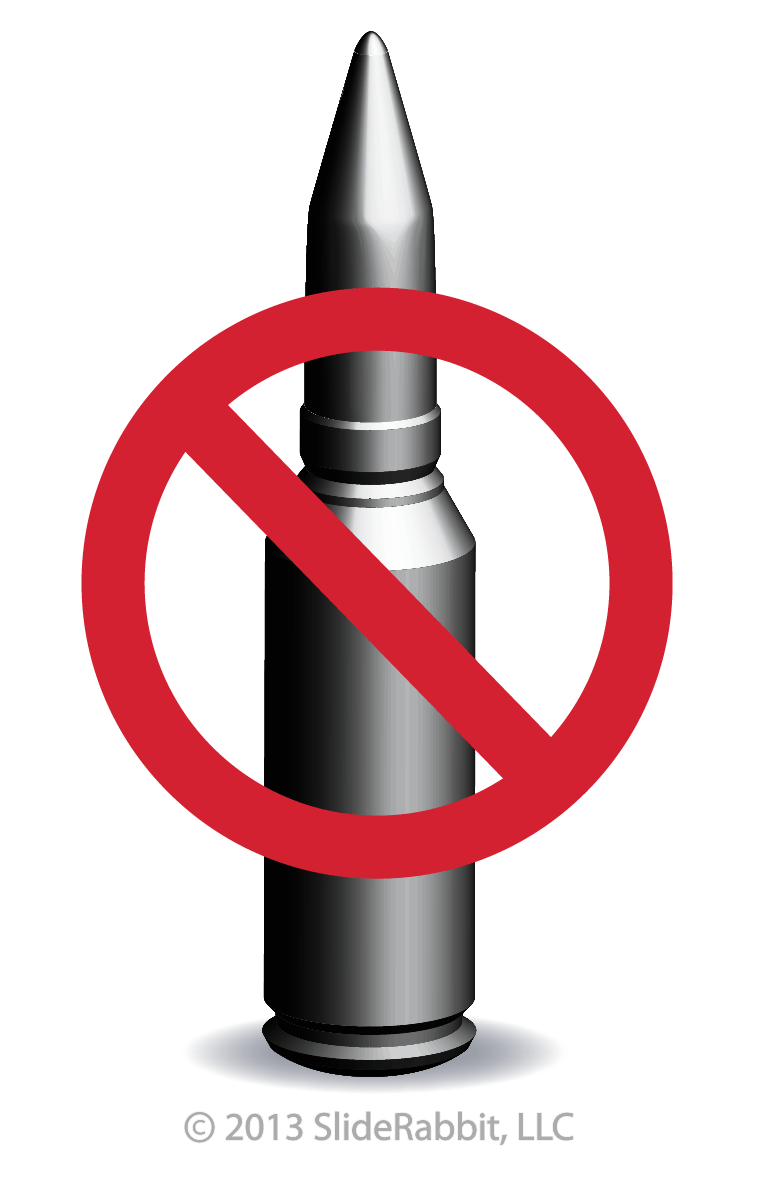
One of the cardinal sins of presenting is also one of the most (mis)used presentation strategies. Say it with me now, “Bullet Note Script.”
We’ve all suffered through one of these – the presenter has somehow confused the purpose of his slides and that of his notecards, and suddenly we are forced to read the exact words coming out of his mouth. This sensory stereo effect causes glossy eyes and wandering thoughts.
But why? Shouldn’t giving the audience the same information in as many ways as possible maximize their retention? <Read More>
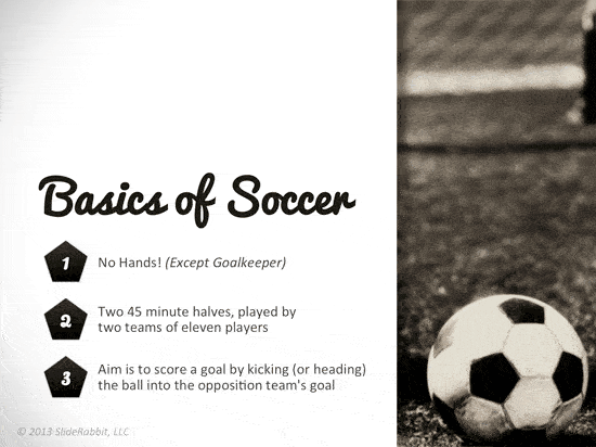
Great presentation design is a balance between art and science. Too often, in the rush to fill the screen with facts and figures, we forget to view the slide for what it is, a blank canvas.
Since the time of the Renaissance, artists have experimented with ways to make their works more visually striking. Fundamental compositional design is just as important as the information that fills the screen. Taking composition into consideration produces more sophisticated, fresh slides…. <Read More>
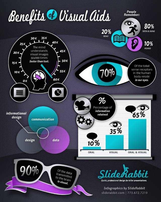
Infographic: Visual Communication
Happy New Year!


Leave A Comment
You must be logged in to post a comment.