

Simple Wins: Professional Presentation Design Tricks
Recently we were lucky enough to teach a course at the annual Presentation Summit on design basics and how they relate to professional presentation design. (If you haven’t heard of the Summit, check out some of the things you can expect to learn in our review of this year’s conference.) We chose to share some of our tips and tricks for creating visually interesting slide decks. If you weren’t able to attend, though, you shouldn’t miss out! Try these visual strategies out in your next deck:
Designing on a Grid
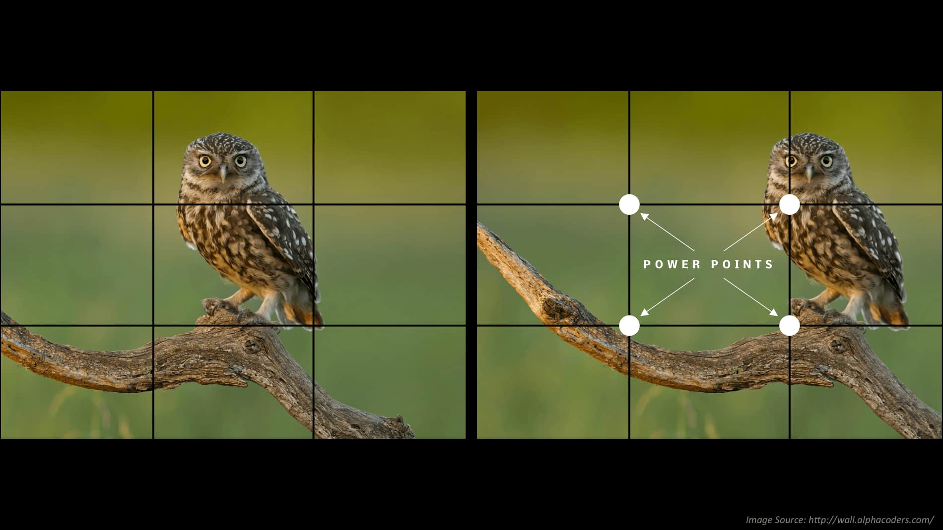 Designers often use grids to help layout content in visually appealing ways. You can use the lines and sections to align your content, create negative space and put the more important or more powerful visual elements in the “power points” (no relation to the software). The grid above uses the rule of thirds, often applied in photography, but grids can take all shapes and sizes. They simply need to be built with regular line spacing. The human eye is excellent at detecting symmetry and order. Using an organizational tool to arrange your content can quickly make it more visually appealing.
Break the Template
 Most templates have some elements that carry through most or all slides: color details, logos, footers, title bars, etc. This is great for keeping a cohesive-feeling show, but it can also get a bit boring for the audience. When you come to a slide with a poignant message, one you really want to resonate with the audience, don’t be afraid to break all the rules of your template. Creating a slide with a bold visual departure will make your audience look up and take note.
Cohesion and Cuts
 Cohesion is a tricky thing. Too much cohesion and we bore our viewers, too many bold departures and the show feels disjointed and amateurish. How do we strike the balance? This is a regular struggle for in the professional presentation design world, so I’ll share our method to creating visual interesting, but cohesive decks.
First we build out a color palette that adheres to our brand standards. Then, we make sure to include a variety of slide background options that fit with the given brand standards. We include white and color block slides, along with full image slides and image slides with a color overlay. Then, we design. As we go, we select the slide background that best compliments each slide’s content. At the end, we pull the show into slide sorted mode – this is important. We want to look at the deck as a whole, rather than each slide on its own. We look for any spots where we’re using the same slide background too many times in a row. We like to move regularly between white and color slides background to keep the slideshow feeling vital and exciting. These can be thought of as “cuts” like in cinema – a quick change of perspective in the same scene. Just make sure that your colors are brand approved and used regularly across all slides and your show will maintain that cohesive feel!
Professional presentation design is, of course, more art than science. However, there are a few tips and tricks we use regularly to improve the look or our slides and the overall impact of our decks. Employing the tips above will elevate your content design and improve your impact.
For a free grid in more 4×3 and 16×9, sign up for our newsletter!


Leave A Comment
You must be logged in to post a comment.