Quick Tips for More
Professional PowerPoints
What comes to mind when thinking of a large corporation? Perhaps, their familiar logo, recognizable brand color, or overall aesthetic. This is called corporate identity, which is essentially the way a corporation presents its brand in the world. Professional PowerPoints should continue this presentation of identity.
Businesses of all sizes benefit from a well-built identity. Using recognizable brand elements in marketing, over time, creates familiarity and builds trust in your target market. In terms of presentations, using your companies branded elements immediately creates consistency and uniqueness in your presentation. Basic brand elements include logos, colors, and fonts. Expanded brand elements can include anything from spokespeople to photo styles to theme music.
Let’s take a look at using basic brand elements to create professional PowerPoints.
Logo
To begin, think about how and where to use your logo. Be sure to incorporate your logo in a standard way throughout. This helps the presentation flow fluidly but also serves as a consistent reminder of who’s behind the presentation itself. This is especially important if your slides may end up on the internet. Own your corporate thought property.

Colors
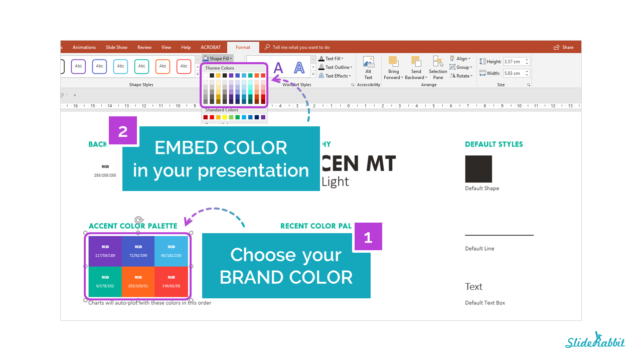
The corporate color palette prescribes the color scheme of professional PowerPoints. Color is a powerful tool that helps tie the entire presentation together visually. It is also a recognizable aspect in branding. Again, when thinking of large corporations, usually alongside a logo, a general color will come to mind.
ProTip: If you are still in the early stages of developing your brand, choose a color that will not only stand out, but represent your company best.

Fonts
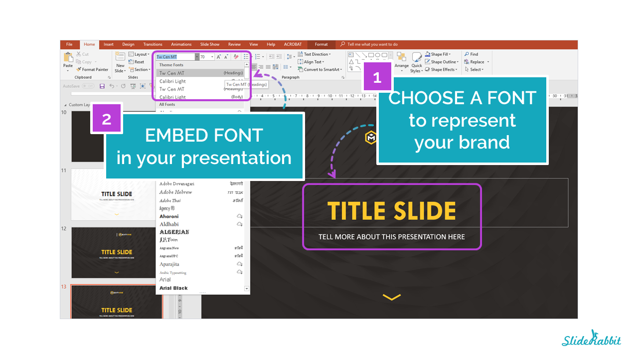
Typography is also key in branding your presentations. A typeface in itself can be so iconic that you’re able to put a name to the company just by glancing at a few words of text. It is important to keep in mind, though, that there are many typefaces to choose from and not all of them display properly on all computers. Here is more information on picking a font based on this criteria.

Need help creating more professional PowerPoints? Drop us a line!


Leave A Comment
You must be logged in to post a comment.