Presentation Design Company Secrets: Icons & Wayfinders
As we mentioned in our recent post on how to reduce text without losing meaning, we recently had an excellent time at the Colorado Non-Profit Association’s Tech Summit. We taught a course on creating more powerful slides with less content and we shared several presentation design company secrets.
Today we want to share another: How to use icons to make your content more immediately understandable while also adding organization and structure to your deck.
Adding Icons
click to enlarge
Icons are simplified illustrations that trigger memory and understanding in your audience.
Our brains understand images more quickly than words, so adding icons to your work will help your audience understand more quickly. Recurring icons also work as a mnemonic device to aid memory.
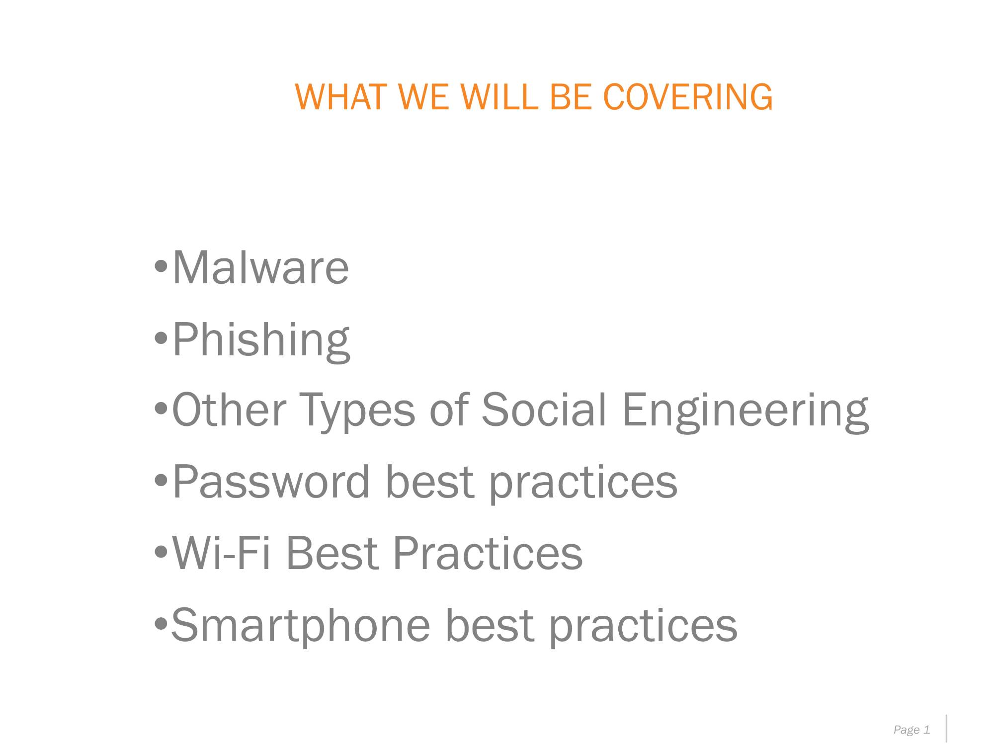
Take this client’s agenda slide. This slide will recur throughout the deck to give structure to the presentation, but it’s just a bunch of dry bullet points.
click to enlarge
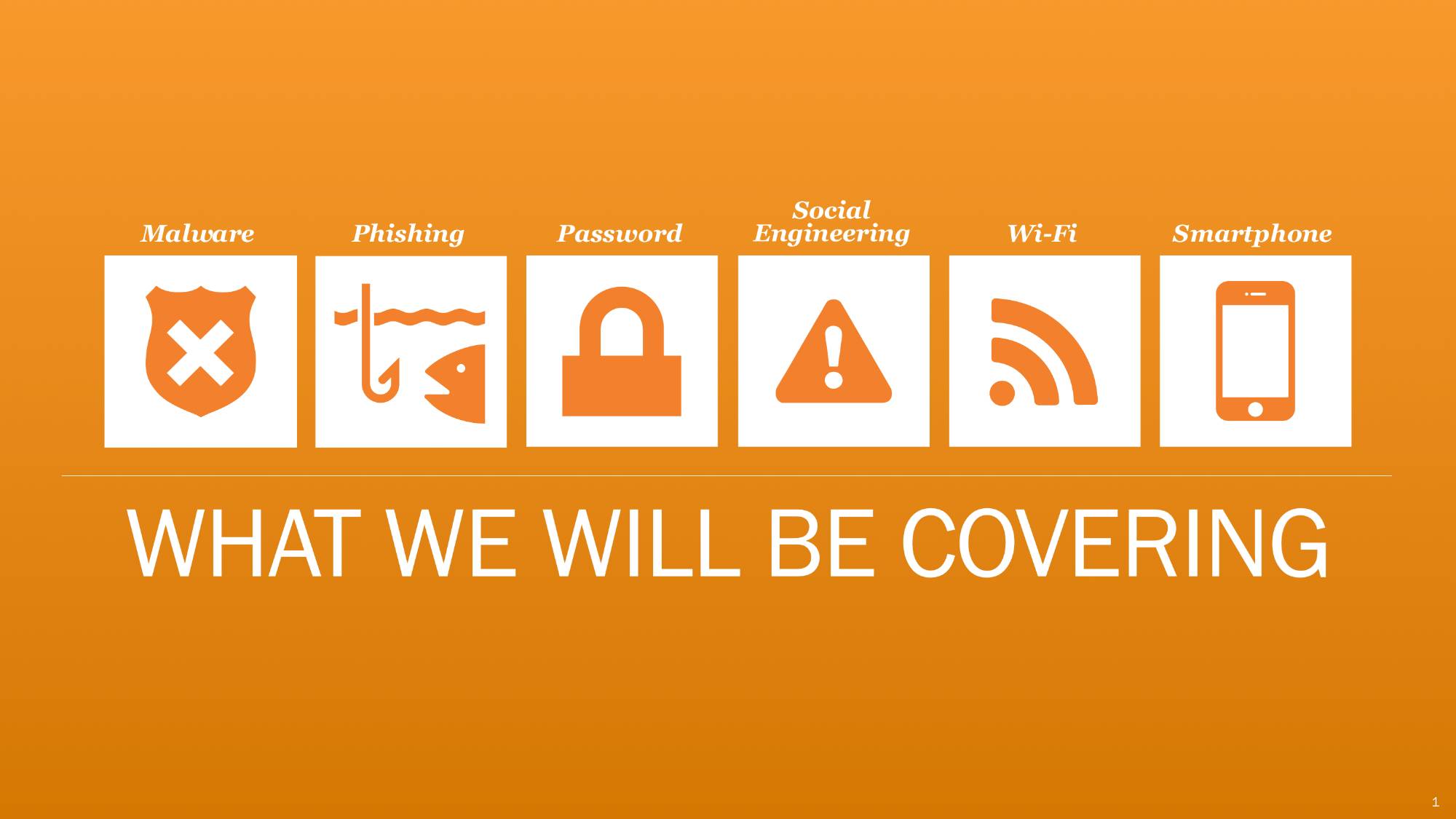
Why not give your audience a little more to latch on to by adding some icons? Here’s the after version of the same slide. The addition of an icon for each section has added theme and visual interest.
Icons are an easy and quick way to add visual cues to your presentations that will help your audience better remember your content.
Putting Your Icons to Work as Wayfinders
Once you’re using icons on your slides, you can take it a step further and use them as “wayfinders,” or markers, to show your audience where they are in the presentation. Adding the icon of the given section to the top corner of each slide will keep even those dosing audience members more oriented to the content.
click to enlarge
In fact, if we’re using icons to mark our subject matter, why not add interactivity to the deck. We can use our wayfinders as an interactive navigation.
In this project for Lease Query, we took the client’s agenda and gave each section an icon.
click to enlarge
We then used these icons to create a navigational piece on the side of the slide and hyperlinked the icons to their respective slides.
After this client left the meeting, he sent his deck as a leave behind – allowing them to browse his pitch deck as if it were a website. Now you’re letting the audience chose how to engage with your content.
Once you have icons for each section, using them to mark where in your presentation you are will help your audience stay oriented. Add interactivity with hyperlinking so that you (or your audience) can use the deck interactively, rather than being stuck in the linear march of slides.
Will you try to pop some more icons into your next deck? Follow us on Facebook or LinkedIn for more helpful secrets from a presentation design company!


Leave A Comment Cancel reply
You must be logged in to post a comment.