Welcome to our Visual Sugar blog! Join us for presentation tips, design tips and ideas, and learn how to improve your presentation skills. Get inspiration and see how SlideRabbit can transform your ideas into engaging, and visually stunning presentations.
Trying Out A New Corporate Identity…
...thoughts?
Presentation Software: Not Just for Slides Anymore
Presentation Software: Not Just for Slides Anymore The phrase "Death by PowerPoint" calls to mind endless, text filled slides marching forward as a suit with a clicker drones on to a room full of bored coworkers. I truly believe that, while presentations like this may still take place, this scene is largely a collective memory. [...]
Warby Parker: A Year In Pictures
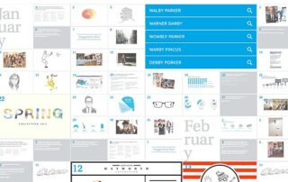
Warby Parker: A Year In Pictures Last post, we looked at Facebook's investment in culturally-geared visual communication: a "secret" internal department charged with creating visually powerful cultural propaganda pieces. But will we see visual communication reach beyond internal messaging into the dry and conservative world of public-facing corporate communication? Via a good friend of mine in the [...]
Facebook’s Analog Research Lab Embraces Visual Communication
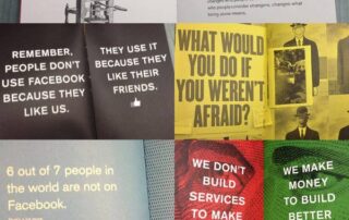
Facebook's Analog Research Lab Embraces Visual Communication High on our wish list is increased use of visual communication in the corporate sphere, both in internal and external messaging. We've previously discussed the engagement, persuasion and information retention benefits of visual communication, but even some of the more tech forward companies are woefully behind in harnessing [...]
3 Tips for Keeping the Bill Down
3 Tips for Keeping the Bill Down Now that 2014 has dawned, many of us have recommitted to the standard annual resolutions. Perhaps, like so many others, one of your resolutions is to save money in 2014. Design budgets may feel like an indulgence, but don't cut them out completely. Instead, check out our tips [...]
Happy New Year!
Here's to a great 2014, from your friends at SlideRabbit.
The Best of 2013
As our first full year in business comes to a close, we're looking back and celebrating the victories, learning from the challenges and gearing up to do it even better in 2014. Since these last few weeks are a great time for reflection, here's a look back at our most popular posts from 2013. See [...]
Simplify Your Presentation
Simplify Your Presentation When is the topic of simplification more salient than during this season, as we all scramble around to get organized for the holidays and dawning of a new year? With the constant conflicting demands of stressful professional lives and hectic personal obligations, it can be easy to forget to step back, breathe in [...]
Happy Turkey Day!
Happy Thanksgiving from your friends at SlideRabbit. Save some stuffing for us!


