A Look Back at 2014
As the sun sets on another year, we’re looking back and reflecting on what we loved about this year and what we can’t wait to improve in 2015.
2014 has been a banner year here at SlideRabbit. We met and worked with the greats in our industry, inspiring clients and brilliant contractors. We designed presentations ranging from instructional seminars to funding pitches and across industries from litigation support to early childhood education. We worked on 66 projects for 32 clients, spoke at the Boulder Tech Summit and beat our revenue goal by over 40%.
While we’re looking ahead to what 2015 will bring, we thought we’d take a quick look back at what was popular on Visual Sugar this year. Here are the top 3 posts from 2014:
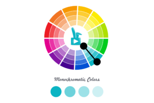
3. How to Build a Powerful Color Palette
Color palette development is a part of our daily lives, so we wanted to share some of the approaches we use to expand an existing corporate palette or to find inspiration for a new palette from scratch. With sight dominating our senses, it is no surprise that colors have come to hold so much meaning and importance in our culture. Consciously and unconsciously, we use color to signify our feelings: a red rose for our love, a yellow one for a good friend. With colors so closely tied to emotion, and emotion so effectively increasing memory retention, it follows that colors are instrumental to powerful and memorable communication.
When selecting a main color for a presentation template, take into account the emotions that the content should produce. Is the material meant to excite the audience, rile them up to a new product that changes the game? READ MORE >>
2. 5 Things We Learned at the Presentation Summit
We were thrilled to attend the annual Presentation Summit this year in San Diego. We had an excellent time and learned a lot. See the post below for our top 5 things lessons. We’re so excited for the 2015 Summit in New Orleans. Perhaps you’ll join us! Sometimes you need a little shake up to remember why you love your job so much. Last week we attended the Annual Presentation Summit, a coming-together of presentation software providers, designers, speakers, coaches and just about anyone else working in a presentation-related field. What an excellent revitalization! We learned so much and met so many excellent new friends. Below, we’ll share some of the tips we found most resonant.* You’ll have to attend next year to get the full effect. READ MORE >>
1. Building an Interactive Infographic in PowerPoint
We’re always trying new ways to push presentation software beyond simple slides. Presentation software is widely available, affordable and approachable for the typical professional. Why not use it for more than just slides? Here’s a case study on a project we did where we do just that. This post has been incredibly popular and republished in other venues like the PresentationXpert newsletter. Lately we’ve been thinking a lot about pushing presentation software past simple slides. Keeping with the theme, we recently received an interesting challenge from one of our clients: an interactive infographic produced and executed in PowerPoint.
Why PowerPoint you might ask? Why not Prezi or Flash? For clients with a large sales team, introducing a new software across the board can be cost prohibitive. We needed a platform that the sales team was already comfortable with and which would allow the team to update numbers and figures on the fly. PowerPoint was the clear answer, but since PowerPoint takes a lot of flack for its linear format, how could we make a truly interactive infographic? READ MORE >>
See you to 2015!


Leave A Comment
You must be logged in to post a comment.