Before and After Design: Sony’s Leaked Slides
It seems that the holidays have come early here at SlideRabbit! We absolutely love making bad design better, and what better opportunity than the recent Sony Pictures’ leak? Let’s learn from their mistakes.
What moved us most about this set of graphics was how much potential they had. These could have been great, informative slides! Leaving the harsh content critiques to outlets like Gawker, we’ll provide three sets of before and after design examples and discuss how Sony’s designer (or, very probably, Sony’s employee with no design background) missed some opportunities to make the information more interesting and easier to understand. Small adjustments to approach and design enhance the slides’ value as communication aides.
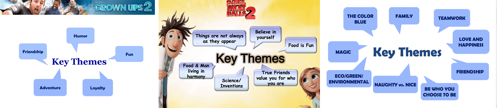
Set 1: Just Throw ‘Em in Talk Bubbles
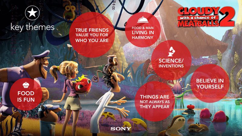
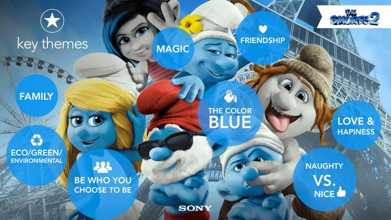
The first example set are Key Themes slides. There is a whole mess of these, but we’ll just look at three. The main content for these slides has been popped into overused and very recognizable PowerPoint talk bubbles. They occasionally vary this basic slide layout by branding it for the movie. We like this approach, but of course, the design leaves a little be desired.
 click to enlarge
The operative word here is KEY themes, but these ideas are all just tossed into talk bubbles like throw away information. Since these aren’t actually quotes, the talk bubbles are meaningless on top of being very “PowerPoint-y.” A more organic shape, like a circle, takes the eye off the background and puts it back where it belongs: the content.
These slides are related and that is communicated visually by using an indicator icon and the same shapes and text treatments, though the colors vary to relate to the content. Each time a slide like this appears, the visual cues trigger the relation.
We’ve also given the slide backgrounds a little facelift. Background images in which the subjects’ expressions and environments reflect the content brings the ideas and emotions to life.

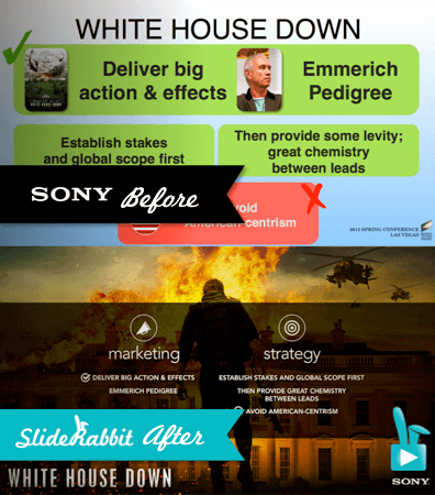
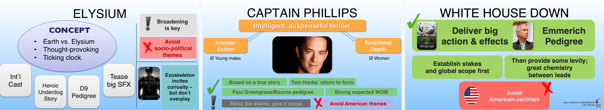
Set 2: Hunting and Pecking for Info
This set of slides explores marketing strategies for some recent movies. Each of these slides focuses on one movie and points out its key concepts, marketing approaches and communication strategies. Weirdly, these slides are not in the same format.
click to enlarge
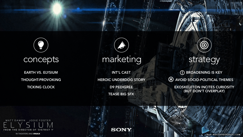
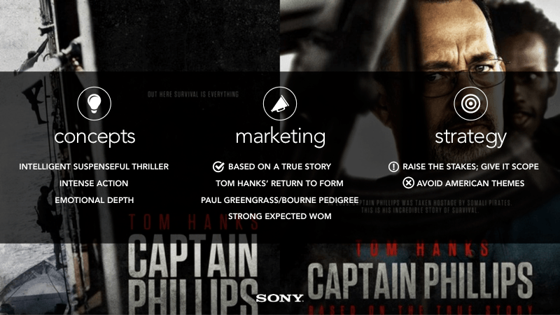
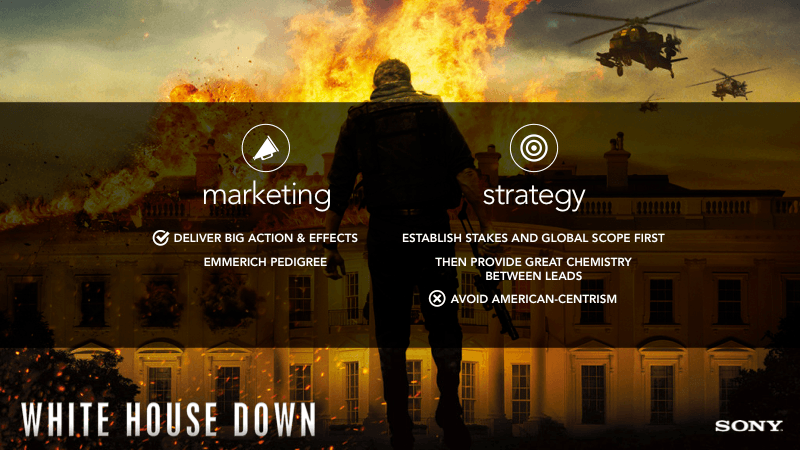
Putting related information in the same place on similar slides frees the audience to concentrate on the content, rather than hunting and pecking to figure out where the information is from slide to slide. We streamlined the layout and used visual cues to organize the information so the audience can find info quickly on each slide.
We also had a little fun dressing up the slides to relate more powerfully to the movies discussed.
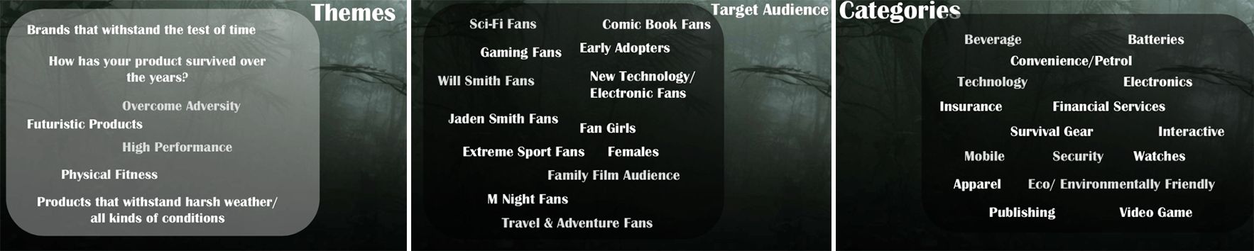
Set 3: Vague Content on Inexplicably Varying Layouts
The final set of slides was the most baffling. The design is strangely ominous, which makes us think all of these slides relate to one movie, though that information is not included. The designs all vary slightly – just enough to be distracting.
 click to enlarge
For the remake, we’re assuming these slides all discuss After Earth, so we’ll incorporate that into the design to give the audience context.
Since we’re talking about the themes, target audience and categories for one flick, we’ll keep the layout the same. Without the distracting changes in design, the audience can focus on the point: we’re taking a deep dive into the important elements of the movie.


Design Should Support Content
The producer of the original Sony slides mishandled the design to detriment of the content.
Good design is meaningful and cohesive. Variances draw the eye, so they should have significance. Overused and purposeless shapes bore audiences who are already weary of death by PowerPoint. Using visual cues and organized placement to link similar information from slide to slide increases comprehension and retention. Being purposeful with design can improve even the driest content.
Could your slides use a facelift? Give us a shout!
Image Credits:
www.hdmovietrailers.eu, http://blog.geogarage.com, http://fashionplaceface.com, http://popdose.com, http://www.henry4school.fr, www.ssninsider.com, www.sickchirpse.com


Leave A Comment
You must be logged in to post a comment.