Google Slides Template Design:
Our Work for Discord
Google Slides template design & development plagues many designers. While the tool is excellent at aiding collaboration, the software itself lacks many of the functional tools that your team may be used to from PowerPoint or Keynote. Fret not, though, Google Slides decks can still be simple and beautiful.
Below, we’ll share our recent work for Discord, a voice & text chat platform for gamers.
Template build
We’ve mentioned before that Google Slides has some functionality differences from PowerPoint. Because the interfaces are so similar, clients often expect the change over to be seamless. This is not the case, and the Discord template was no exception.

For this template, we encountered, and solved, two main Google Slides issues.
Firstly, Google Slides does not allow for custom fonts.
Although there are issues with custom fonts in PowerPoint, it does give you the ability to add, and now embed, custom brand fonts. While custom fonts may be important to your brand, Google Slides does not have the ability to add fonts. To solve this issue, we reviewed the available fonts and chose the closest. Roboto, in this case.
Secondly, Google Slides does not have image placeholders.
For long-time users of PowerPoint, this always comes as a shock. Placeholders are instrumental in creating consistently laid out slides.
Because Google Slides does not have the same functionality, we had to fake out some image options. In the middle slide all the way to the right, you’ll see a dummy image for the Discord developer dashboard. We use a fake image with instructions for the client on how to switch in the new image. This is not always foolproof, but it’s the best Google Slides can do… for now. Google Slides is constantly updating and we may see this feature in the near future.
Content design
When it comes to content design, this deck had a lot of room for improvement. The draft from the client was completely pre-design, so we got to create a fun and active design from raw text. We talk a lot about avoiding bullets and using icons as visual cues for content, but this slide is a great example.
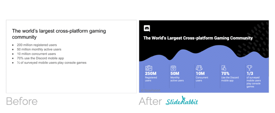
This plain bullet slide was transformed into a high-impact introduction to the app and their user community. Bullets scream to the audience that the slide is underdeveloped. They can make a presenter look lazy or uninterested in the topic. Using bold colors and simple icons, this slide is now more memorable and fun to engage with.
See more of this project here.
Need help with a Google Slides Template Design & Build?
Moving a team from one software to another can be a headache. The first step: begin with functional files.
Please reach out and we’ll be happy to help with your Google Slides template design and any decks you’d like to convert from PowerPoint to Google Slides.
SlideRabbit offers custom slide design and many other services. Check out some of our work.
To stay in touch and learn more, sign up for our newsletter and stay tuned for more blog posts!





Leave A Comment
You must be logged in to post a comment.