A look at the Fyre Fest investor presentation
Chances are you have heard of the Fyre Festival, the giant mess that ended in multiple indictments and two nearly unbelievable documentaries. If not, SlideRabbit will leave it to Netflix and Hulu to fill you in there. The Fyre investor presentation has leaked and we’d love to weigh in on these slides.
Inspiring imagery
From a design perspective, the imagery is the most moving element of the investor presentation. The images inspire excitement. They are well-selected to work together and conjure the airy, romantic, magical feelings of island life and music festivals.
However, the text design here could use some work. That third line, with the increased text sizes, reads much too wide. Stick to 45 – 75 characters of text per line and balance text to be visually appealing, rather than drawing the eye from side to side of the slide.
Instead, reduce the size of the comma and knock everything after it down to it’s own line.
Missed opportunities
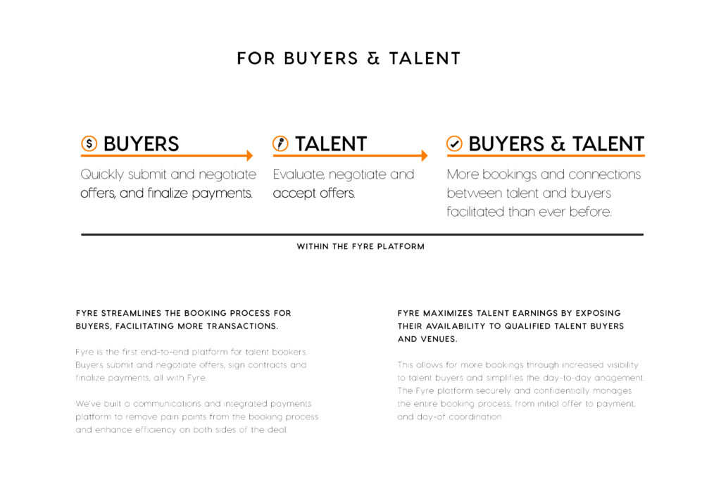
 On this slide, the creators have missed an opportunity to use the form of a diagram to support the main idea. The diagram along the top is in a linear format. But really, the intention is an aggregate or overlapping idea. A more appropriate and visually informative diagram might be a Venn or a layout that implies combination.
Further, the diagram is redundant to the title, so get rid of the title altogether. Allow the diagram to be the header and main focus of the slide.
Additionally, this slide contains much too much text. This text is too low contrast and long to be impactful. Each text section should have its own slide if it’s important enough.
Alienating jargon
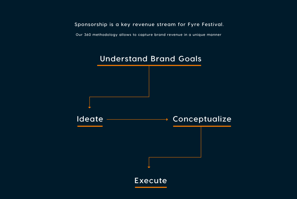
 Jargon and buzzwords are often empty and meaningless, as appears to be the case with the Fyre Fest. A good investor will spot a slide like this for what it is: the absence of a real plan.
This diagram misses the mark even more as we have a reference to a “360 [degree, presumably] methodology” illustrated in a non-circular expression.
Also note, we’ve lost style consistency with the previous all caps title style. Inconsistent styles are the hallmark of a tossed together presentation.
Need help with your investor presentation? Drop us a line!


Leave A Comment
You must be logged in to post a comment.