From Numbers to Narrative:
A Data Visualization Webinar
In our data-driven world, decision-making processes hinge upon the insights gleaned from data analysis. From optimizing operations to driving strategic initiatives, data underpins nearly every aspect of business today. When working with large sets of numbers and data, it’s important to think about data visualization and how you will present your data in an effective way to tell a compelling story with your data.
Sweet Slides 101 webinar series: presentation & communication skills
Our Sweet Slides 101 webinar series focuses on crucial presentation and visual communication skills. In March, we explored how to cut down on text to make more visual slides in From Wordy to WOW. This quarter we offered a data visualization webinar, From Numbers to Narrative.
Check out the highlights below, including some examples of data visualizations used in presentation, and on our YouTube channel!
From Numbers to Narrative | Sweet Slides 101
Data-savvy professionals enjoy more success
It’s not enough to simply possess data – it’s how we interpret and communicate that data that has a profound effect on how we perform in our professional lives.
In fact, 85% of those who consider themselves data literate report performing “very well” at work. Only 54% of non-data literate professionals would say the same. (From Qlik)
By honing data skills, from analyzation through communication, professionals can strengthen their careers and expand their opportunities. Leveraging data visualization in presentations empowers presenters to visually convey key data points and effectively illustrate the stories from their data to executives and clients.
How do you create storytelling with data?
When faced with a set of data, the challenge is to understand that data and be able to communicate important insights with context so that the recipients of the information take appropriate action.
To get from raw data to a true story, there are four major steps:
-
Review data for understanding
The first step to telling a data story is to take the time to really understand your data. What elements do you have to work with? Is there a time component? Are you working with absolute numbers or percentages? Given all the data that you have, what are all the questions that you could answer?
In our example below of the original data used in a presentation, we identified many answerable questions from a fairly simple set of data about calls into a call center.
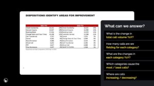
But we can’t tell ALL of these stories – it’s simply too much for an audience to process. So how do we decide what we need to share through data visualization in our slides?
-
Identify simple insights from the data
Data doesn’t happen in a vacuum – once you are familiar with the data, widen your lens and consider context. Instead of focusing on all of the data you have access to, change your focus to only what your audience needs or wants to know.
What is the business question at hand? Might the data support a decision regarding budget allotment? Or marketing strategy? What is the story you want to tell with the data?
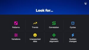
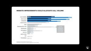
In the example slide above, the title told us that we are hunting for areas for improvement. Where we are fielding the most calls, we might have some opportunities for changes that will reduce call volume. Once we know what we’re trying to answer, we can review the data from that lens, searching for things that might provide insights, including patterns, trends, correlation, cycles, variations, unexpected data, industry alignment, and sudden changes.
-
Choose the right graph for data visualization
Different graph types are best for different usages. Some graphs, like line graphs, are best for evaluating trends over time. Bar graphs, on the other hand, make comparing data easy. Pie graphs, of course, are best at showing a snapshot of composition.
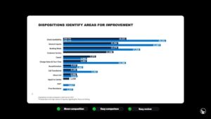
We explored several graph types for our data visualization slide, but ultimately landed on this clustered bar graph, split by category. This graph allows us to see the general composition of the call categories, with the largest volumes listed at the top. We can also easily assess the year over year change in each category.
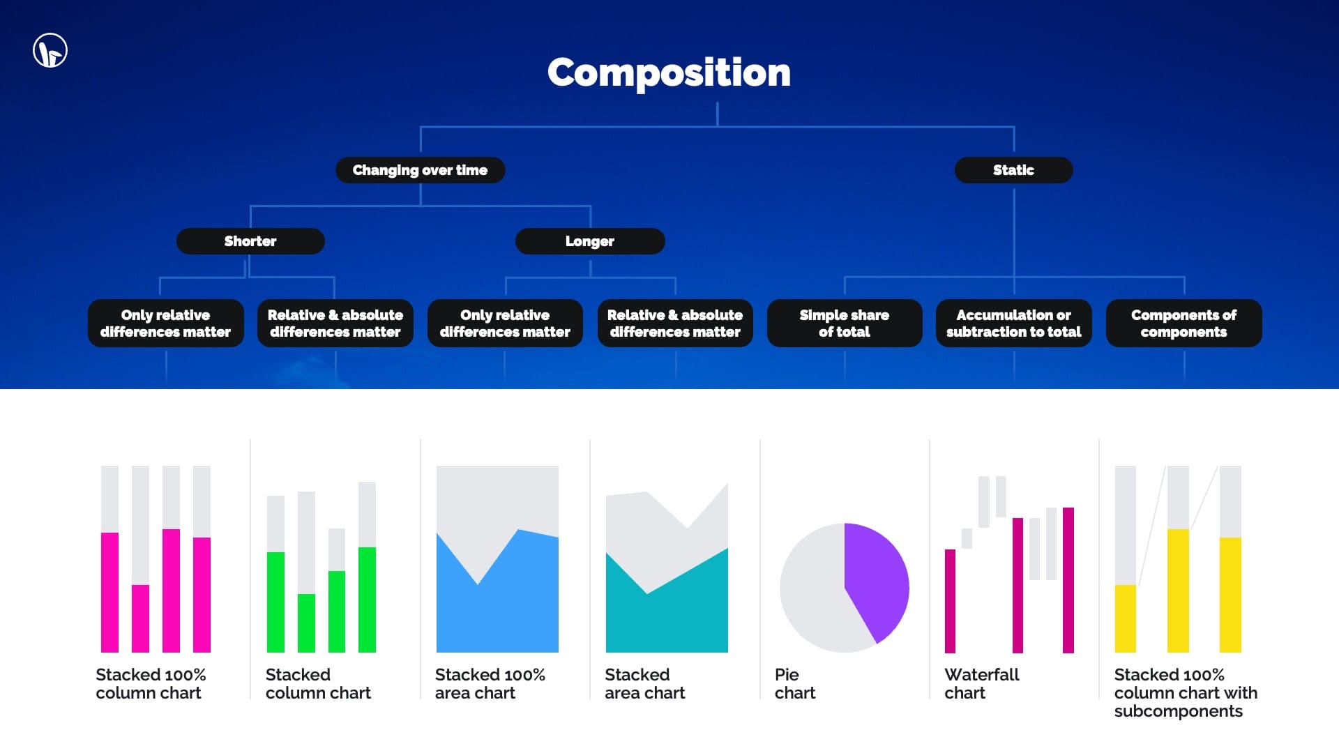
Depending on what story you are trying to tell with your data, there are many different charts you may consider. Below are some data visualization examples for presenting composition through various types of graphs for different use-cases.
-
Provide context and action items to tell your story
While the above is a good data expression, it is still not a story. Remember, data doesn’t happen in a vacuum; you need to tell a story with your data. So consider what context might be necessary for the audience to arrive at the correct conclusion. Be selective! If we share too much detail, we might muddy up our main takeaway.
But beyond context, for this data to really become a story, we need to supply the “so what?” It’s not a story without an ending, so include the recommendations and action items – what should we DO about the data?
In our example, we added crucial context with data visualization in the presentation to explain outliers, used color to draw the eye to important data and strengthened our title to include our conclusion so that the data wasn’t just a statement, but a story.
When it comes to data, think about creating TRACTion
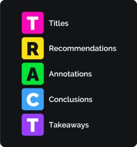 When we gain traction, we’re making progress and gaining buy in on our ideas or guidance.
To make sure that your data visualization is working hard, check to see if have included the following:
Titles that provide guidance on what the data is telling us
Recommendations on what changes or decisions should be made according to the data
Annotations that draw attention to the right things, or explain outliers in your data visuals
Conclusions drawn from your evaluation of the data
Takeaways about next steps and action items
What did the attendees think about this data visualization webinar?
100% of attendees said they learned something at our data visualization with storytelling webinar, From Numbers to Narrative. This session in particular was filled with a lot of action in the chat, so thanks to all of the attendees!
Here’s what some of them said:
“Loved the practicality and step by step example.”
“I liked the real-life examples being used and interaction with the participants.”
“I liked the pace and the TRACT acronym – a good refresher of what to keep in mind.”
Our next Sweet Slides 101 webinar is coming up!

What: Captivate & Engage
In this session, we will explore tactics and strategies to hold the attention of any audience with your presentations, whether in person or virtually.
When: October 2, 2024. 11am PT/2pm ET.
Where: Register here!
Don’t miss another session!
 Ready to transform your presentations into powerful tools for success? Each session we’ll tackle a crucial skill for impactful presentations. From data, to narrative, to design tips and tricks, there will be something for anyone looking to make better slides.
Looking for something more comprehensive? We also offer presentation workshops and trainings for teams! All workshops are built-to-suit with a custom curriculum built around your teams’ skills & needs. Get in touch to discuss further!
Or follow us for more updates and opportunities to attend the right presentation skills webinar for you.
Get in touch however you prefer:







Leave A Comment
You must be logged in to post a comment.