
Data Visualization
Recently, my husband convinced me that we should start a fantasy football league with a bunch of our friends. Getting 12 teams of busy adults to commit to months of weekly tasks wasn’t easy, so we ended up with a wonderful mix of friends, neighbors and friends of friends.
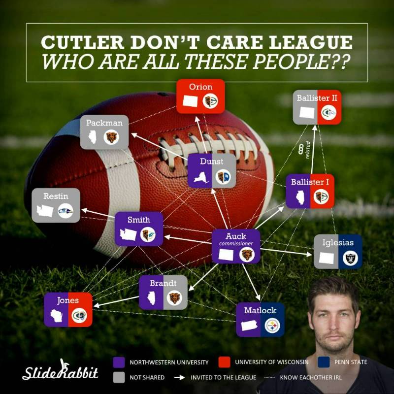
The challenge was, while there were lots of commonalities in the group, we were the only couple that had met every other couple. I needed a quick way to communicate that even people who hadn’t met shared a common alma mater, state or NFL affiliation. So was born, our league data visualization:
Data visualizations have become common place in the professional world. Often they use proximity, color and/or shape to tie like information together. Some of these are incredibly complex and technical. They are also usually computer generated and leave a lot to be desired, design-wise.
These same approaches to connecting like data can work with everyday information to communicate relations quickly and clearly.
Color
Sorting things by color, or color coding, is so commonplace that it might be the most frequently used informational design tenet. Color coding is understandable and easy to see at a glance. It’s best to use when there are a few major categories, so that the colors are easily spotted and differentiated. Here, I used color to group team members by alma mater.
Icons & Logos
Marking items with logos or icons is a great way to show attributes. Certain steps of a process, for instance, might require a different mix of approaches like phone calls, emails and meetings. Marking data items with shape cues gives extra information without overwhelming the viewer. Here I used state shapes and NFL team logos to give a little more information about each of our teams. Other teams can easily spot those with whom they share a home state or favorite team.
Connectors & Proximity
I’ll group these two together because if you’re using connectors, you should also use proximity to keep the design simple. Items that are closely related can be connected implicitly by their proximity and explicitly with connector elements (here, lines & arrows). A chart that is only proximity/connectors is often called a “mindmap.” For our data visualization, I used solid arrows to show who brought who into the league and dotted lines for teams that had met in person.
Data visualizations communicate connections and similarities among data points visually. Using color, proximity and attribute icons, every day information can be understood and retained more easily and quickly. It has worked for us here at SlideRabbit. Try it with your fantasy league!
Another great type of data visualization is an infographic. Check out one of our portfolio to see some samples!


Leave A Comment Cancel reply
You must be logged in to post a comment.