Professional
Presentation Templates:
Three Tips To A Better Template
Here at SlideRabbit, we design and develop professional presentation templates for clients with varied needs and approaches. Some organizations are filled with technically savvy professionals chomping at the bit to express their creativity through slides. Others, with experts in specific fields, who are also tasked with hacking together presentations. If you are thinking of putting together a corporate template for your organization, here are three things to keep in mind.
Know The Audience
Professional presentation templates are most powerful when they are tailored to the ability levels of those who will use them. Templates can take people from PowerPoint (or Keynote!) luddites to capable presentation developers, or they can give experienced users a more stylized and cohesive starting place for even better presentations. If your template is too difficult or confusing to use, beginners will feel overwhelmed. If it’s too basic, your more advanced users wont see its value. There are several ways to tailor the template along the spectrum of user ability – but start by first identifying where your users will fall on that spectrum.
Provide Instructionals
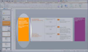
One you’ve figured out the ability range in your user group, you can help bridge the differences by placing instructional notes in your template for your lower-ability users. These notes can be about formatting, tips and tricks, or standards on how to use each layout. They can be placed on the master slide level, so that they appear every time a layout is used, or they can be placed on slide level in your sample slides.
Build in Variety
A simple way to improve the quality of every team member’s presentations is to build variety and excitement into your template. Beginners will have an easy way to dress up their slides and more advanced users will be able to express their creativity without improvising.
In this client template, you can see that we’ve given several options for each slide; varying the backgrounds and image placements. The last slide has a set of images that can be swapped in and out. Giving your team built in options like these will keep everyone on brand while allowing for a little personal interpretation.
Templates are the first step to getting everyone at your organization on the same page. Each presentation will get a kick start in design and cohesion and everyone will be able to easily assemble together their own decks.
Want help setting up an easy-to-use and well-designed professional presentation template? We’d love to help! Drop us a line!


Leave A Comment
You must be logged in to post a comment.