PowerPoint Text Formatting Basics
When you’re giving a live presentation, text on your slides can be the death of your success. That said, using PowerPoint or other presentation softwares to create company documents or marketing pieces is a great way to keep costs low and get more design into your docs.
If you’re doing the latter, you may be running into some funky text formatting issues. We recently completed one such project and here we’ll share a few hidden PowerPoint text formatting tools.
This post will take a glance at those deeper and more precise text formatting tools available in PowerPoint, how they work and when to use them.
The main formatting ribbon has a section for text formatting and a ruler for adjusting margins, here:
These tools will get you by for the majority of your text needs, especially if you’re designing a live, on-screen presentation. If you’re designing a document though, you may encounter spacing and formatting problems as you add more text. PowerPoint isn’t designed as a word processing software, but it does include some additional settings for formatting text more precisely.
Autofit
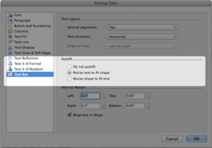
Autofit settings are the bane of your existence if you’re trying to quickly and cleanly copy in text. There are three options for autofitting, all appropriate for different layout and formatting goals.
Do not autofit:
Text inserted into shapes with this setting will not change size to fit within the text area. Instead it will run over the box, but your text sizes will remain consistent.
Resize text to fit shape:
Text inserted into shapes with this setting will decrease or increase in size to fit the text box. If the content varies in length, font sizes will be inconsistent throughout, but your layouts will be visually consistent.
Resize shape to fit text:
Text inserted in these shapes will retain its sizing and expand the dimensions of the box to accommodate the content. If you’re going for a spatially uniform look this will be a headache, but your text sizes will remain consistent.
Get to the Autofit settings by right clicking on your text and selecting Format Text, then selecting Text Box from the left hand selection pane.
Paragraph Spacing
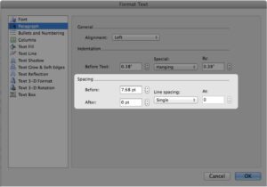
Spacing adjustments affect how closely lines of text appear to each other.
The spacing tools to the left refer to the paragraph spacing – space before & after paragraphs. Add space between headers and bullets by playing with the spacing before and after the selected text.
The line spacing on the right adjusts how close together lines within a paragraph lie.
Make these adjustments in the master slide layouts and create a consistent spacing system throughout.
Get to the Spacing settings by right clicking on your text and selecting Paragraph or selecting Paragraph from the left hand selection pane, if you already have the Format Text dialog box open.
Text Level Increase/Decrease
The default master layouts in PowerPoint prescribe formatting for different “levels” of text, like bullets and sub bullets.
Though it may be tempting to use the tab kay to move sub bullets over, tab does not always maintain the consistent formatting. Instead, use these buttons to move through the available text level formats.
Here they are in action:
The Text Level Increase & Decrease buttons are in the main Paragraph section of the Home tools ribbon.
PowerPoint text formatting can be a bear, but there are some tools available to hone text layouts so that even text-heavy documents can be designed and produced in presentation software. Try out these tricks on your next PPT-produced doc.
Having an issue we didn’t cover? Leave it in the comments and we’ll try to help out!
Want more tips & tricks? Be sure to add VisualSugar to your RSS reader or subscribe using the widget at the top of the sidebar!


Leave A Comment
You must be logged in to post a comment.