State of the Union Slides
Whatever you may think of President Obama’s actual policies, perhaps there’s at least one that both sides of the aisle can agree on: visual aids should be simple, sparse on text and cleanly designed.
The slides from the 2015 State of the Union are up, and it warms our hearts to see the highest office in the land take visual communication so seriously. Just like in years past, President Obama chose to present his data visually and hammer home some of his main points with poignant imagery.
There’s always room for improvement; Nolan Haims points out the regrettable red text on navy decision and some slides deviate pretty wildly from the color palette. But overall the State of the Union slides have a fresh and modern feel. We’d like to applaud the White House for investing in some great visual communication.
Now let’s peek at a few of our favorite slides. There’s some nicely executed designs and perhaps a few opportunities for improvement. Be sure to contribute what you liked or what you’d like to improve in the comments below.
The Data Display Slide
Although a graph slide seems like a no-brainer, we see a lot of slides with information like this in bullet points, data tables or just the wrong type of graph.
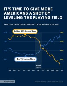
Here the designer set each data series against it’s own vertical axis, bringing home the inverse relationship of earnings between the top 1% of earners and the bottom 90%. The Reagan Administration is indicated on the graph to show the steep changes during that period, presumably making the point that his policies were a causal factor.
Some might see this graph as a bit dishonest. At first glance, it looks like the top 1% has already far surpassed the bottom 90%.
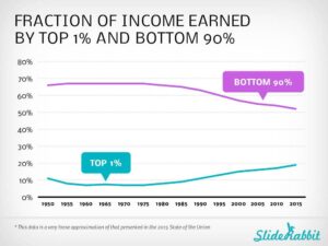
A more fair and balanced look at the data might look like this.
We placed some mimicked data on the same axis and the story is a little different. In fact, instead of having crossed around 1989, the lines are only still crawling towards each other. It’s a great example of how the display of data affects how it is interpreted.
The Break Slide
We love a good break from the template with a differently colored slide! A slide like this makes the audience sit up and pay attention: this slide is different so it must be important.
This design is well done because the continuity of font and layout, plus the well chosen color, keeps the presentation feeling cohesive. The content here is also important; the quote is personal and emotional, driving home the President’s point with poignant anecdotal evidence. Putting a human face on the slide makes it even more personal, though we might have opted for one of Astrid during her health crisis or with her children to inspire an even more emotional response.
By the way, if you’re wondering what the font is, it’s Whitney and you can purchase it here.
The Image Slide
We love this moody picture slide. Full bleed images (meaning that the image extends to all edges of the slide) have a powerful effect. Adding this transparent overlay in the template’s navy adds both a cohesive feel and a feeling of mood to this slide. We’re meant to feel the negative impact of the statistic, almost as a song played in a minor key changes the meaning.
Although some government agencies have yet to catch on, our Commander in Chief knows the value of a good visual aid. We can only hope that in future years, the slides will be broadcast to the masses in real time. In the meantime, watch them in action here.
Are we friends on Facebook yet?


Leave A Comment
You must be logged in to post a comment.