Slide Design: Learn From Print Ads
When it comes right down to it, the success of any presentation comes down to a sell. Maybe you’re selling a product, or a brand, or maybe an argument. Why not, then, steal some hints from those that make a living making sure products get sold: advertisers.
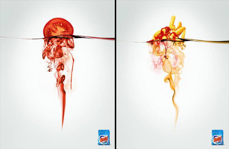
Great ads rely on attention-grabbing images, brand cues and limited copy. Consider these gorgeous ads from Bold Detergent:
Bold has created images so powerful and clear that no words are needed. They simply include a brand cue to drive home the point: Bold Detergent dissolves your messiest stains.
Visual images lessen processing burden and are more attention-getting and memorable than words. Is it any wonder, then, with all the cognitive benefits, the best print ads are those high on visual impact and low on copy?
Here’s another example:
Attention grabbing, memorable and clear. With only 7 words!
Slides are no different than print ads: they aim to sell. Thus, slide design should abide by the same principles.
1. Use powerful images. The more visual your slides, the more engaged your audience will be. Depending on your purpose, it may be appropriate to work in humor. And put away the clip art: The more professional your images, the more credibility you will garner.
2. Limit the copy. Ever hear the internet expression “TL;DR”? It’s shorthand for “too long; didn’t read” and you can bet that anything more than a few necessary words will get the same treatment during your presentation.
3. Use brand cues. Does the template you’re using reflect the brand identity you represent? Are you incorporating fonts, logos and other distinctive assets to remind your audience just who is behind the moving and visually engaging show they are experiencing? You should be.
By creating slides that have the impact of great ads, you are creating mental images in the minds of the audience. Associate your brand and your sell will stay with your audience long after you’ve left the podium.
Further Reading/Happy Clicking:
BuzzFeed’s 12 Best Print Ads of 2012
AdWeek’s Best Print Ads of 2011-2012


Leave A Comment
You must be logged in to post a comment.