Six PowerPoint Designs
For Six Bullets
We’ve outlined four alternatives to bullets in a previous SlideRabbit post. But what happens when the content truly is best as blurbs of text? Here’s what the boring bullets look like:
But can we find something with a little more style?
A huge variety of PowerPoint designs can be used as substitutes for traditional, boring bullets. The six examples below illustrate more visually interesting layouts that are still simple to create.
Icons
Icons are great attention grabbers. Select six suitable icons to make the slide more visually interesting. Then lay them out horizontally with the content below.
Images
Images are similar to icons; they immediately associate an idea with the text. Place the images horizontally with the content below to make it easier for the audience to read and remember.
Grids
The Rule of Thirds suggests that grids formatted into thirds are pleasing for the eye. This is a simple way to make the text area of the slide feel more purposeful and cohesive.
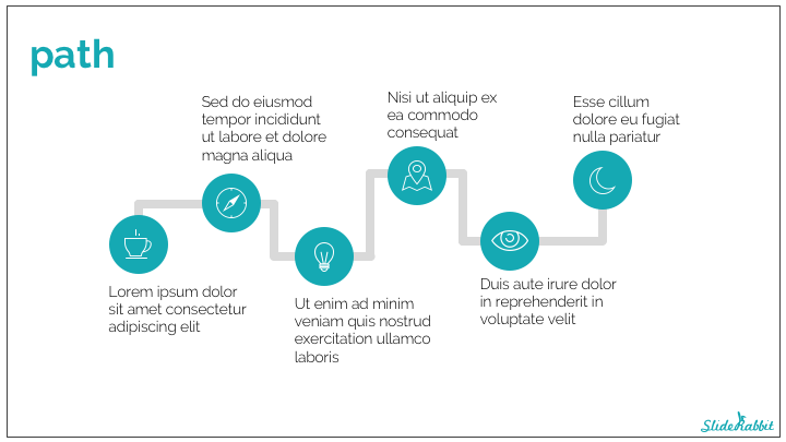
Path
An ordered array of information can be displayed on a journey layout. A clear path helps guide the audiences to form associations and inferences from direction and flow.
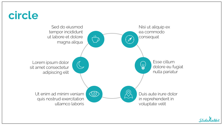
Circle
A standard circle is another excellent tool for laying out bullets, especially if the content forms parts of a whole idea or works together cyclically. This layout allows for plenty of active whitespace on the slide, which increases its’ consistency and readability.
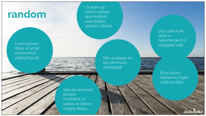
Random
If it doesn’t matter what order the bulleted information needs to be in, why not have some fun with it?! “Chunking” your bullets into shorter width blurbs makes them easier to read. Then spread the chunks out throughout the slide to make the slide fun and exciting.
Need help making your bullet-heavy slides more interesting? Drop us a line!





Leave A Comment
You must be logged in to post a comment.