From Wordy to Wow:
A Presentation Skills Webinar
Our new presentation skills webinar series, Sweet Slides 101, debuted last week with our first session: From Wordy to Wow. This session focused on reducing verbiage on slides so that main messages can shine through.
Scroll down for the full video!
Why is it necessary to reduce text on slides?
We all hear it all the time — avoid too much text on slides! But why?
There are several reasons that its important to write succinctly on slides and keep presentation text to a minimum for maximum impact:
-
Keep attention
Did you know that we default to reading over listening? When we put too much text on your slides, we get up staged by our own visual aids! Our audience can also read faster than we can talk, so when they finish reading, and tune back in, we are giving them information they already have. Cue the glazed eyes and phone-checking.
-
Communicate more effectively
Our brains understand images 60,000 times faster than they understand written language. The more we can communicate visually, and pare that with an engaging talk tack, the more effectively we are communicating with the audience. Using simplified text on slides enhances better and faster understanding, setting the audience up for more information retention over time.
-
Avoid Overwhelm
Our working memory, where we process new information, can only process so many unconnected ideas at once. When we throw too many stats at the audience on a slide, the working memory will discard what it cannot handle, which means the speaker has lost control over what the audience will take away.
By pacing out the information, the speaker keeps a better handle on what the audience is processing and understanding.
How can one reduce the number of words on presentation slides?
Now that it’s clear that we must reduce words to be effective communicators, how? It can often feel like we need everything that is on the slide to make our points. But how do we know how many words should be on a PowerPoint slide?
Here are some ideas on how to go about trimming text on slides:
-
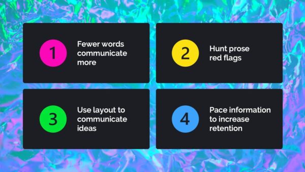
Look for Red Flags
Too often, a presentation is written quickly and then delivered. Instead, stop and get out that editing pen to look for red flags.
Words can often be cut when we look for red flags that we are writing in a prose style, rather than in a presentation style. Some of these red flags might be:
- Obvious text – What’s obvious in the context of the presentation or slide?
- Redundancy – Are phrases, words or ideas appearing multiple times on a given slide?
- Qualifiers – Are we qualifying our ideas in text, rather than in our talk track?
- Colloquialisms – Is our style of speech sneaking into our presentation writing?
- Detailed information – Have we boiled the content down to main messages?
-
Use design to express ideas
By looking for opportunities to replace words with visuals or to use layout to express relationships between words and ideas, we can communicate more immediately. For instance, instead of a sentence like, “Speakers must find a balance between providing detail and providing accessible main messages” one could potentially put the words “detail” and “main messages” on a seesaw graphic. Now our sentence can become our talk track and our visuals are illustrating our ideas, providing the audience with an easy-to-understand graphic.

-
Pace information
An audience can only handle so much new information at once. When we throw too much at them too quickly, we’ll lose them. Similarly, if there’s too much text on a slide, people will disengage. Rather than cramming many ideas onto a few slides, pace the information out in more digestible bits, and use MORE slides. Changing the visual stimulus often not only reduces overwhelm, but also increases attention, as the audience feels less like than can look away.
Conclusion & reminders: fewer words, better slides

Slides with fewer words communicate better for three main reasons:
- Simpler ideas are easier to understand and remember.
- Less visual clutter helps the audience find the important information.
- Avoiding mental overload is crucial to communication.
Wordy to WOW! the video:
Never miss another one, subscribe to our YouTube Channel!
Our next presentation skills webinar is coming up!
What: From Numbers to Narrative
In this session, we will demystify data display. Expect to learn to think through a set of numbers, experiment with choosing the right graph for your message, and how to make that graph as impactful as it can be.
When: June 12, 2024. 11am PT/2pm ET.
Where: Register here!
Don’t miss another session!
 Ready to transform your presentations into powerful tools for success? Each quarter we’ll tackle a crucial skill for impactful presentations. From data, to narrative, to design tips & tricks, there will be something for anyone looking to make better slides.
Looking for something more comprehensive? We also offer workshops and trainings for teams! All workshops are built-to-suit with a custom curriculum built around your teams’ skills & needs. Get in touch to discuss further!
Or stay in touch with us for more information and opportunities to attend the right free presentation skills webinar for you.
Get in touch however you prefer:


Leave A Comment
You must be logged in to post a comment.