Design Trends in Custom Presentation Design for 2016
As 2015 comes to a close, some new and fun trends in custom presentation design are starting to emerge! We’ve spotted a few popping up on websites and in slide design projects. Read on for some inspiration for your next deck and check out SlideRabbit’s homepage to see if you can spot one or both!
Brilliant Gradients
Flat, matte design has been ruling the roost for a few years now, but the winds of design trends are changing. This month, Pantone announced a two-tone color of the year for the first time ever. Even before that, bright and brilliant gradients were starting to pop up in presentation design and websites alike. Here are a few we like from around the web:
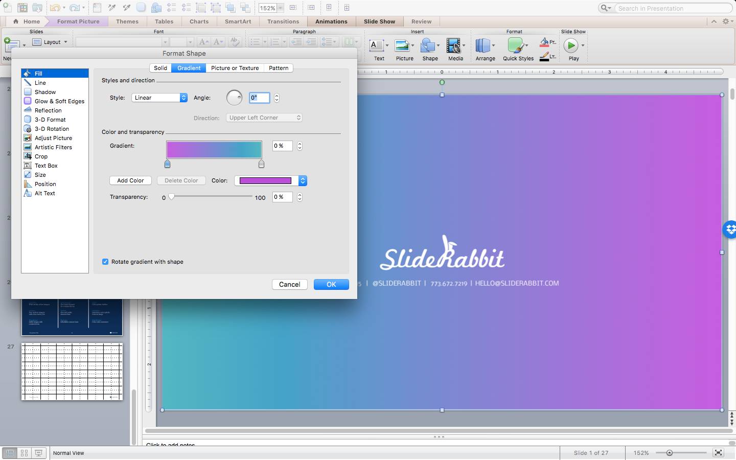
Want to work gradients into your custom presentation design? Create and adjust gradients by right clicking a shape and selecting “Format Shape.” Liner gradients are in so use your “stops” to select two colors from your palette and away you go:
Auto Animations
Animated infographic videos (like these) have been building in popularity over the last few years. Because the animation is often complex they are generally producing in animation software like Affer Effects. There are a few ways to incorporate this energetic feel into your presentations though! Using autoplay animations (rather than click-to-advance) and shortening up the play time can make your slides feel alive without giving you that cheesy “Powerpoint Animation” feel.
Here’s a brief snippet of an autoplay ad we created in PPT for a client who wanted to be able to edit and upload monthly updates:
Looks like 2016 is bringing us some fun trends to play with in the custom presentation design arena! We can’t wait to see what else it has in store. Leave us some of your favorite emerging design trends in the comments.
Looking for some help bringing your slides into 2016? Drop us a line!


Leave A Comment
You must be logged in to post a comment.