You have 8 seconds to engage an audience.
With today’s attention spans, presenters need to focus on how to engage an audience right from the beginning.
Did you know Microsoft’s recent study found that the human attention span is down to 8 seconds? With such fleeting and fickle mental stamina, presenters are in a tough spot.
How do we design for distraction?
When designing your presentation, plan for that 8 seconds of attention span. Partially, we can address that issue via our slides or visuals. Paired with good speaker techniques (post to come shortly), we can help our audience stay with us by keeping things exciting and fast-paced.
Here are three design approaches to engage an audience:
Increase your slide count. With an attention span so brief, leaving a single slide up for multiple minutes is a dangerous game. Instead, take your slides and break the content out for more frequent advancement of slides. A slide with three pieces of information can become a title slide and three informational slides, where you can expand on each piece.
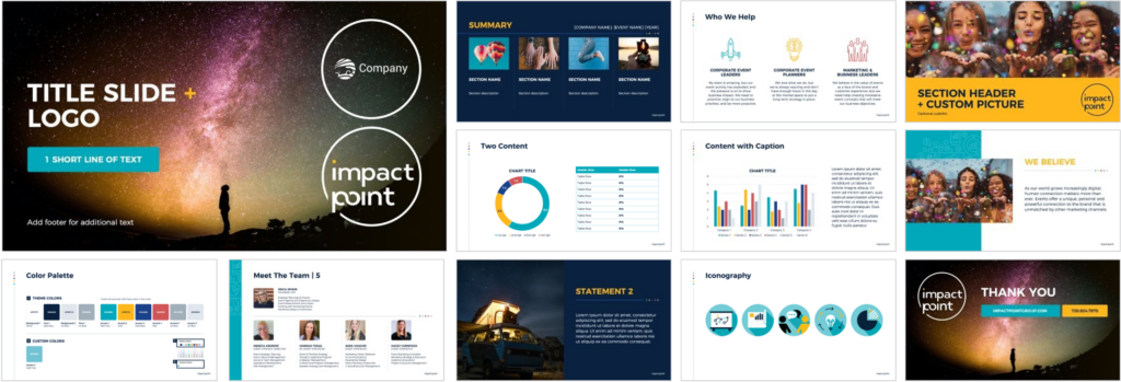
Create visual cuts. Avoid that march of boring white slides (or dark slides, for that matter). Think of creating an attention-grabbing switch of colors and visual approaches. From dark to light to imagery, etc, a visibly-changing screen is hard to look away from. Design your template with this approach in mind: create a color palette and stick to it to keep is cohesive, but create varied background approaches that hang well together.
Here’s an example of a recent template that uses this approach:

Create call & response slides. In the previous post about grabbing attention right off the bat, we discussed how questions work to engage an audience. Our brains can’t help but try to formulate an answer. By creating slides that plan for and anticipate your questions and your expected answers, your slides can work to reinforce any of your verbal questions.
Creating a dynamic and exciting presentation has never been more important. With attention spans continuing to decrease, it is harder and harder to engage an audience. By using these visual tricks, you can make it harder for your audience to look away.
What else should we consider when dealing with 8 seconds of attention?
Check out our post on How to Start with A Bang, creating an attention-grabbing presentation introduction. Stay tuned for an upcoming post on tips for presenters for engaging distracted audiences.
Want to up your presentation introduction game? Whether it’s help with your design or a workshop for your team, let us help!
SlideRabbit is a presentation-focused agency. From slide design to template construction to narrative sculpting and concept generation, we help our clients show up looking their best.
All presentation design is custom for each client, fully editable, and brand adherent. We work in both PowerPoint and Google Slides.
Looking to train up your team? We also provide workshops, ranging from technical training to how to think like a presentation designer.
Reach us at hello@sliderabbit.com.
Let’s be friends! Sign up for our newsletter to become an expert in all things presentation, including learning to engage an audience. Connect with us on Facebook, Twitter or LinkedIn!


Leave A Comment
You must be logged in to post a comment.