Perfect Product Presentations:
4 Before & After Examples
If you have goods or services to sell, you need a product presentation to highlight your product over the competition. Recently, our client, Pynwheel, came to us for help with multiple product presentations. Most important in persuasive selling competitions is to focus on the client’s needs and make sure your design emphasizes your best selling points.
Here are a few before & after examples of better product presentations:
Put your selling points front & center
Remember that your content is king. Including stock illustration just for “something visual” takes attention from the important statistics. Your presentation design should focus on promoting your information visually.
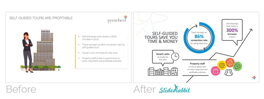
Consider how the audience will read the slide
You’ve probably heard that we tend to read slides from upper left to lower right. This isn’t exactly right in all circumstances, but we DO read things according to text hierarchy. Make sure the largest text on your slide contains important information. Demote labeling information, like the Self Tour header here, into a less prominent space on the slide.
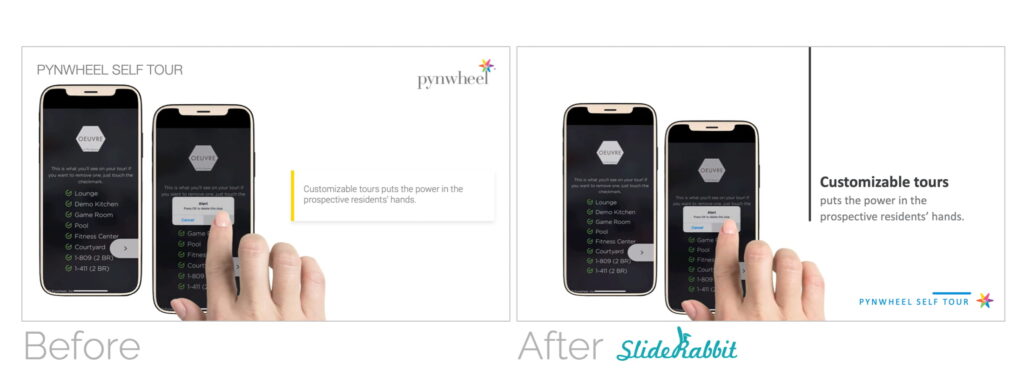
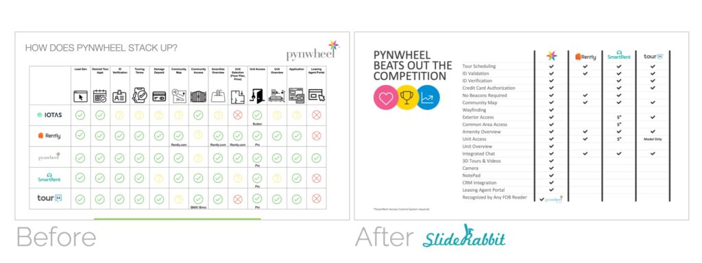
Simplify design so the conclusion is clear
Competition slides are key to giving your prospects clear information on how you compare. Make sure that your design is simple and easy to understand at a glance. Set yourself apart visually, and avoid overcomplicating the slide.
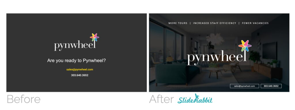
End strong: the call to action
Your last slide should contain information on how the prospect can move forward. More than that, you can maximize this last touch by repeating some of your best advantages. Don’t miss an opportunity to remind them why they need you!
Want to see more of our work for Pynwheel? Check out some additional samples from this client.
Want a perfect product presentation of your own? Drop us a line!



Leave A Comment
You must be logged in to post a comment.