3 Ways to Reduce Text for Effective PowerPoint Presentations
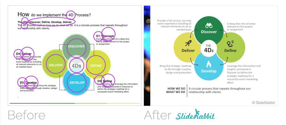
The easiest way to create effective PowerPoint presentations is to remove all of the “blah blah” from your slides. Below are 3 helpful word eliminating strategies.
Split up the content onto multiple slides
Rule of thumb – a slide should only contain one piece of information for live presentations. For instance, one slide should not contain information on how apples grow on trees AND how carrots grow on roots. Put your carrots on the next slide.
This rule can get a little fuzzy though, when you are using slides for a self guided pitch where the clients will need more written information in the absence of a speaker. Make your slides easy to digest and less daunting to read by splitting up the content onto multiple slides. The less information on each page, the more your audience is likely to read… and remember. 
Remove redundancy
Redundancy, redundancy, redundancy… why do we need to read the same word 3 times? We don’t! Audiences tire of a lot of reading. Make sure your title, text and graphics work together succinctly. Use text and graphics to complement each other, rather than repeating words and ideas.
Use the notes layout as a handout auto-generator
Free yourself from putting a lot of words on slides using the speaker notes section below the slide. This strategy is especially useful for slide handouts. The slide should only contain visual content and crucial text. Additional information and explanation can go directly beneath the slide in the notes section. Worried about the text not looking up to par? The text in the notes can be designed as well!
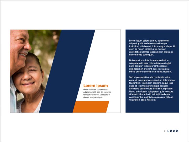
Check back for our next post which will cover the technical skills to make notes page layouts like this:
Looking to make more effective PowerPoint presentations? Drop us a line!


[…] nurses, and other busy healthcare professionals, their time is valuable. Additionally, when you reduce the content in a presentation, you make the most of the audience’s time. Thus ensuring that your attention is maintained […]
[…] that should be taken into account to make a PowerPoint presentation more useful. This way, you will avoid very long texts on the slides. Indeed, you can rely on the use of images and graphics that serve to illustrate or […]
[…] PowerPoint, it is essential to simplify all the information we want to provide. If we’re going to show a very broad content, we must know how to organize it […]
[…] a presentation, it will always be necessary to add text. But when it’s too much, your audience can get distracted reading and won’t pay attention to what you expose. However, this can be avoided since some […]
[…] most cases, a lawyer’s presentation includes a lot of text. Above all, if the exposure is exclusive to legal services. In this case, the personalization of the […]
[…] Minimize the amount of text on the slides and give maximum prominence to the images: photographs, and diagrams are the first thing that will attract the viewer’s attention. […]
[…] it is preferable that you add the necessary texts in the slides to showcase your golf club. Or better yet, help yourself with key points or a concept map to […]
[…] 3 Ways to Reduce Text for Effective PowerPoint Presentations […]
[…] 3 Ways to Reduce Text for Effective PowerPoint Presentations […]
[…] 3 Ways to Reduce Text for Effective PowerPoint Presentations […]