PowerPoint Presentations:
Quick Tips for Better Tables
This is the last in a series of posts where we covered quick tips for improving common chart types for great PowerPoint presentations. Click for Bar Charts, Pie Charts and Line Graphs.
Communicating and sharing data may be the most common use for internal slides. Whether pulled in from Excel or built in the slides, PowerPoint offers several defaults for your charts. Below you’ll find some simple design tips that will take your graphs from blah to BOOM.
We’re including just some basic software skill tips here, which can be found in the Chart Design and Format tabs in your PowerPoint interface.
If your organization needs in depth training on data display theory and approach, look no further than our friend Nolan Haims. Nolan offers tailored, in-person workshops to help companies better express their data.
Tables
While it’s true that many times data is best expressed in a graph, there are some times when the underlying detailed information is necessary. Some of PPT’s default styles can be pretty drab.
Here’s a look at the PowerPoint default style and a few ways to improve it.
On the left, is PowerPoint default Medium Style 1. The colors and fonts will vary according to the theme used. On the right is a customized table that is more visually appealing.
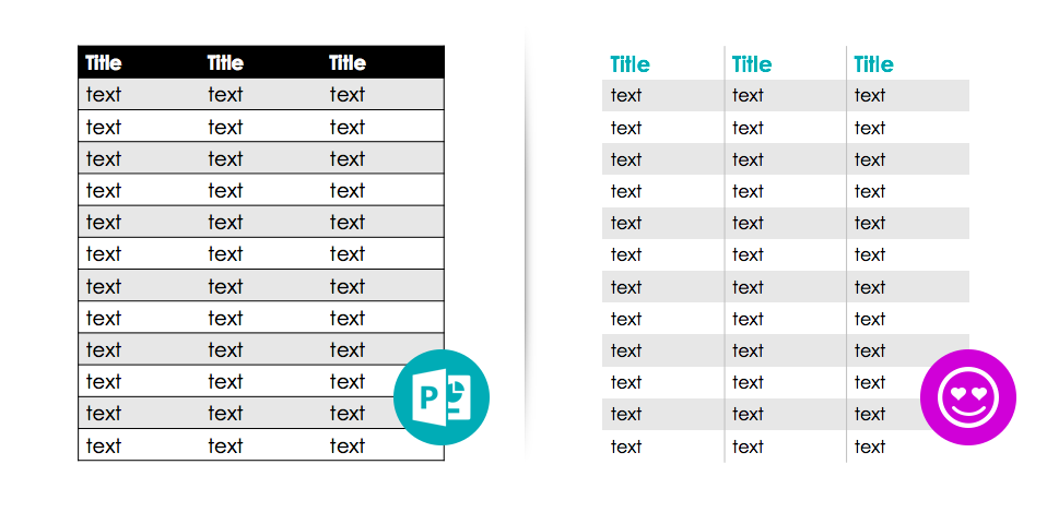
click to enlarge
Here’s how we got there:
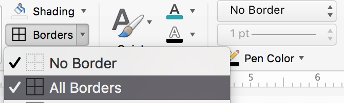
- Remove all the border lines: Border lines can make your slide feel heavy and dated. Here’s where to find the remove borders option:

- Add a vertical border: Once all the heavy borders are gone, use the same set of tools to re-apply only a slight vertical border, as needed. This will give your table a little structure without being too visually overpowering.
- Remove the header bar: Often the header bar is too heavy & bold. Remove it and change the font color to a bright theme color, rather than a dark text color.
- Adjust the font sizes: Make the new header row slightly larger than the rest of the data.
Click for similar posts where we cover improving Bar Charts, Pie Charts and Line Graphs.
Need some help making great presentation slides? We’d love to help.


Leave A Comment
You must be logged in to post a comment.