Make Your Slides Striking With the Rule of Thirds
 Great presentation design is a balance between art and science. Too often in the rush to fill the screen with facts and figures, we forget to view the slide for what it is, a blank canvas.
Since the time of the Renaissance, artists have experimented with ways to make their works more visually striking. Fundamental compositional design is just as important to great slides as the information that fills the screen. Taking composition into consideration during the design process produces more sophisticated, fresh slides.
The Rule of Thirds is a compositional rule of thumb for creating visual images. It was first named by John Thomas Smith in 1797, but can be spotted at work in paintings dating from the Renaissance and likely beyond. Using the rule of thirds increases the tension and visual interest of the slide, and helps create and balance negative space.
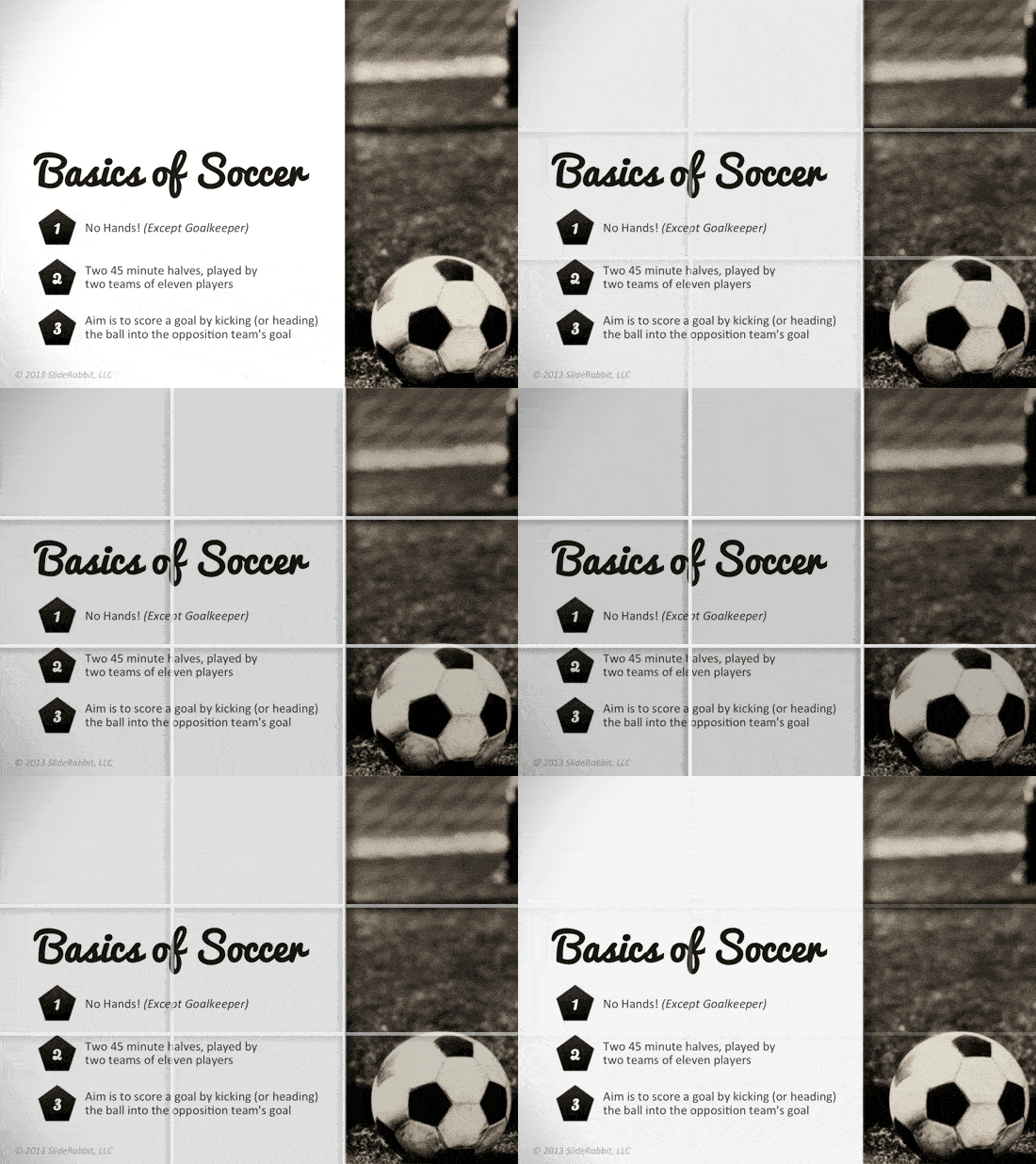
To use the rule of thirds, imagine the slide as divided by two lines, both horizontally and vertically. The 9 section grid creates guideposts against which to align areas of high contrast, negative space and “sections” of information.
Take for example, this simple slide on the soccer basics. This is a fairly typical slide and not all that terrible. The creator has included a visual element, paired down the text and used theme-appropriate graphic bullets. The composition lacks some finesse though – the picture on the right is crushed against the side of the slide and the text area is large and sparsly filled. The result is a visual imbalance that gives the eye no place to rest.
Apply the rule of thirds to elevate the sophistication of this slide to the next level. In the second example, the proportions of the slide fit the rule of thirds, creating negative space and a more visually interesting slide. The soccer ball now sits in its own grid section and the shadow of the goal line falls directly on the top bisecting line, creating a “horizon” with the top of the title. The text area of the slide feels more purposeful and cohesive when set against the negative space above.
Great slide design is about much more than sharp graphics, carefully selected text and persuasive data. Think of slides as little works of art; basic compositional principles can be employed to make a good visual aid more striking and memorable.


Leave A Comment
You must be logged in to post a comment.