Spotted! Presentation Design Trends for 2017
Last year we predicted a upturn in brilliant gradients and autoplay animations. Boy, were we right! Those 2016 trends ended up in many presentations and new brand identities. At the risk of breaking our streak, let’s take a look at a few of the presentation design trends we’ve spotted for 2017.
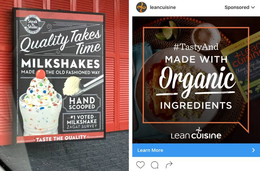
Sources: Steak & Shake and LeanCuisine advertising
Hand-drawn style fonts
Mixing fonts is nothing new. In fact, most brands use both a serif and sans serif font. These two fonts are then used to complement each other and create visual interest.
Check out the two advertisements to the right, both of which pair sans serif fonts with “hand-drawn” fonts. We’re guessing that these more script-looking fonts will continue to pop up in marketing and presentations in 2017. Advertising is a great place to spot new presentation design trends; they are always on the cutting edge of brand identity.
SlideRabbit Work
Movement in space
PowerPoint is finally catching up to Keynote and Prezi with its morph and 3D animations, but until the majority of users have Office 365, we still think the usage of these features will be limited.
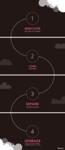
There is one PowerPoint feature we expect to see a lot more of in 2017: the Push Transition. With the Push, PowerPoint appears to operate in space, like Prezi. Use Design elements to create continuity between slides and guide the viewer’s eye.
At left is an animated diagram spliced into 4 slides. It appears to travel through the sky. Here is the Push is vertical, but it can also be applied horizontally.
Not only is the effect unexpected and fun, it can be used to break up text heavy diagrams while still maintaining the overall sense of spatial relation. Try it out on your next timeline or detailed diagram.
Overlays on soft focus photography

Sources: ChampCollection.org & Tropicana.com
Soft focus photography has started to pop up on a lot of websites. The sites above both use soft focus photos as interesting and branded backgrounds for overlaid text and logos. Soft focus works well because it doesn’t compete with the content on top, yet still adds visual interest.
Web design is another great indicator of upcoming presentation design trends. Sites are the public expression of a brand and good presentation design follows their lead.
Looking to update your presentation style? Let us help.

Leave A Comment
You must be logged in to post a comment.