PowerPoint Design:
Quick Tips for Better Line Graphs
This is the third in a series of posts where we will cover quick tips for improving common chart types for great presentation slides. Check back for Bar Charts, Pie Charts and Tables.
Communicating and sharing data may be the most common use for internal slides. Whether pulled in from Excel or built in the slides, PowerPoint offers several defaults for your charts. Below you’ll find some simple design tips that will take your graphs from blah to BOOM.
We’re including just some basic software skill tips here, which can be found in the Chart Design and Format tabs in your PowerPoint interface.
If your organization needs in depth training on data display theory and approach, look no further than our friend Nolan Haims. Nolan offers tailored, in-person workshops to help companies better express their data.
Line Graphs
Line graphs are best for quickly communicating change over time or showing and comparing trends. They are simple to make and understand.
Here’s a look at the PowerPoint default style and a few ways to improve it.
On the left, is PowerPoint default Style 1. The colors and fonts will vary according to the theme used. On the right is a customized chart that is visually tighter and more succinct.
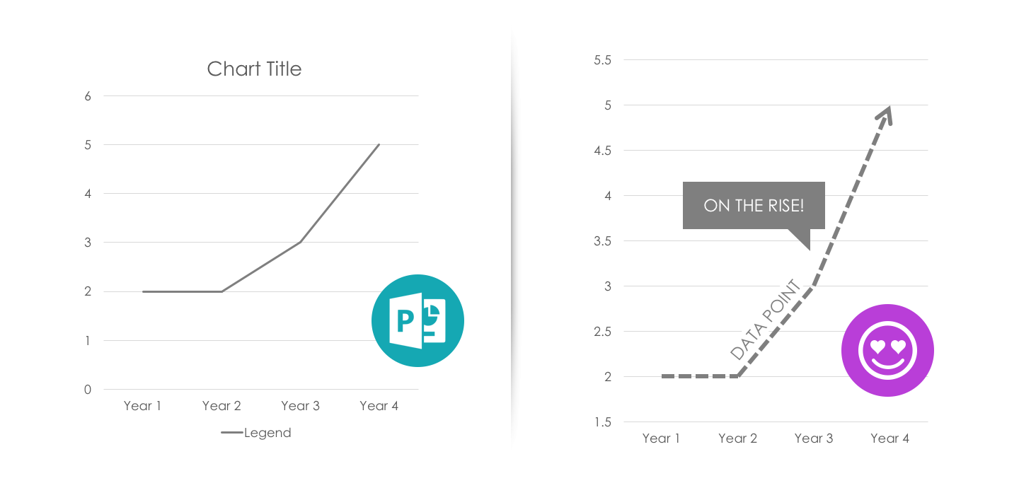
Click to enlarge
Here’s how we got there:
- Delete Unnecessary Elements: Remove the chart title and legend. The chart title is usually redundant to the slide title. Use data labels or text boxes to better visually associate the data to the category name.
- Adjust the Data Line: Thicken the line weight of the data point or a data point that should be emphasized. Add an arrow head for data on continuing trends.
- Adjust the Scale: Adjust the x or y axis to focus on the data represented and add drama to your line slope.
- Shrink the Chart: Now that removing the title and legend have reduced unnecessary lost space, shrink the chart to allow for more white space on your slide.
- Add a Takeaway: Add an annotation to further clarify the point.
Check back for similar posts where we cover improving Bar Charts, Pie Charts and Tables.
Need some help making great presentation slides? We’d love to help.


Leave A Comment
You must be logged in to post a comment.