


Business Presentation Design:
How Does Color Affect A Presentation?
Recently we did a webinar for PresentationXpert on how to use Slide Diets to create more powerful presentations. We’ve been overwhelmed by the resulting flood of questions about business presentation design. We did a quick vlog to address some of those questions. However, one theme stood out so starkly we wanted to address it here more thoroughly: How does color affect a presentation?
Color and Attention
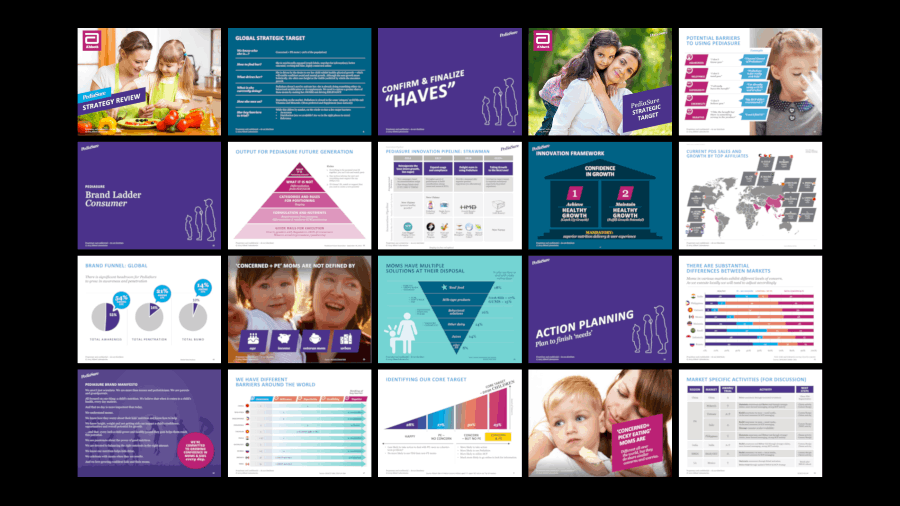
When it comes to how color will affect brain function, we must turn to the experts. This study examines how color usage can aid memory by catching our attention. Dr. Carmen Simon, one of my personal heros, also talks about using visual “cuts” to catch and hold attention. “Cuts” are frequent background and imagery style changes so that the audience does now habituate to a standard background. Switch between white, color block, and image slides to grab and hold attention. Use a strong palette to sure it feels cohesive! We advocate for this method in every deck, here’s an example from our work:
Color and Legibility
Most of the color questions we receive revolve around very specific color combinations. We can tackle each of them here, especially without exact hues. However, the general rule on color mixing, especially when it comes to text, is high contrast.
If the template is:
- Dark. Make sure that your main elements are light.
- Light. Use a darker colors for content.
- Patterned. Choose a color high in contrast to the most dominant color in the pattern. Use big enough text or elements that the solid color will dominate the visually busy background.
- A specific color. Try white and black if the color is light or dark enough. If those don’t work, find a color across the color wheel and in the opposite saturation as your background. Here’s more information on how the color wheel works.
Color and Connections
Our brains are programmed to create associations among information. We have learned to draw both implied and explicit information from color.
Brands already use color to create positive associations with their products:
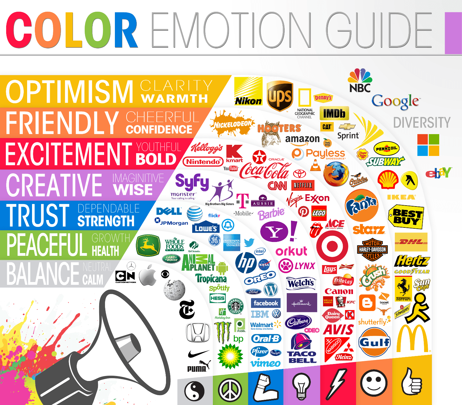
source: The Logo Company
The same thing can be done in business presentation design. Whether you’re working within a set brand palette or you have freedom to create your own, consider the emotions that certain colors provoke. This is a subtle way to take visual communication to a new level.
Color inspires a lot of doubt when it comes to presentation design. It can be tricky to work with, but the results can be both beautiful and impactful for the audience.


Leave A Comment
You must be logged in to post a comment.