


In almost every slide deck, there’s at least one assertion requiring the back up of solid data. Presenters are faced with the challenge of how to display this data in a way that supports the conclusion offered in an easily understood way.
When choosing a format for data display, ask yourself the question, “What does this slide have to prove?” (Then, make that answer your title.) Explicitly identifying the main argument will help you evaluate whether your chart choice is doing its job. Let’s take a look at some common data display formats* and how and when they are best used:
Tables
Tables get a bad rap when it comes to informational design, but that’s only because they are often used when another format would have better represented the data. True, tables fail to make trends and patterns immediately obvious, but they still have value.
 Tables are great at comparing detailed information about several related items at once. Take this table slide: The table delivers a lot of information about the importance of the various application capabilities across a range of application categories in a matrix format. This data does not need to convey a trend or pattern through numbers; it needs to show similarities across categories. This is when a table work best.
Line Graphs
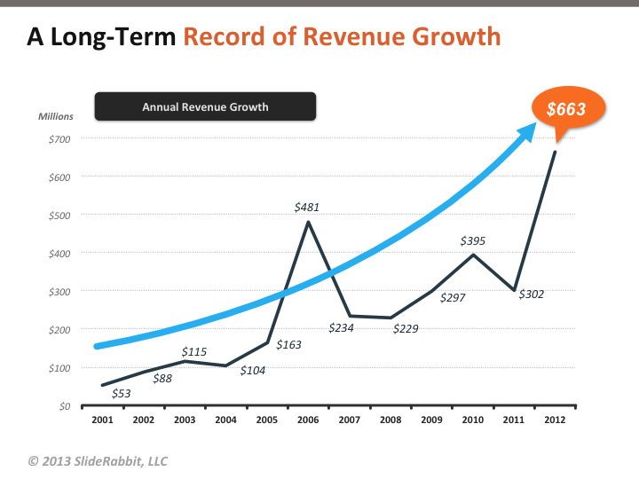 Often line graphs are used to compare too many elements at once; the result is a cacophony of lines squirming all over the slide. A good rule of thumb for choosing a chart type is to select the chart type that will prove your argument most simply. Line graphs are best for showing simple trends over time.
Bar Graphs
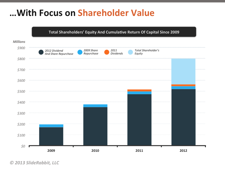 Bar graphs are a great choice when the information is a little more complex but needs to be easily compared over time or between groups. In this example, each bar represents overall stock value, and the stacked sections give more detail about where that value is coming from. Although it does represent change over time, using a line graph for this data would look chaotic.
Pie Charts
Pie charts take a lot of heat in the design community, but I firmly believe they have their place. They must be used carefully, as it is true that it is harder for the brain to judge the differences in area than differences in length. Pie charts should be avoided when the specific numbers represented are vital, when there are only small value differences among data points or when there are more then 5 or so data points.
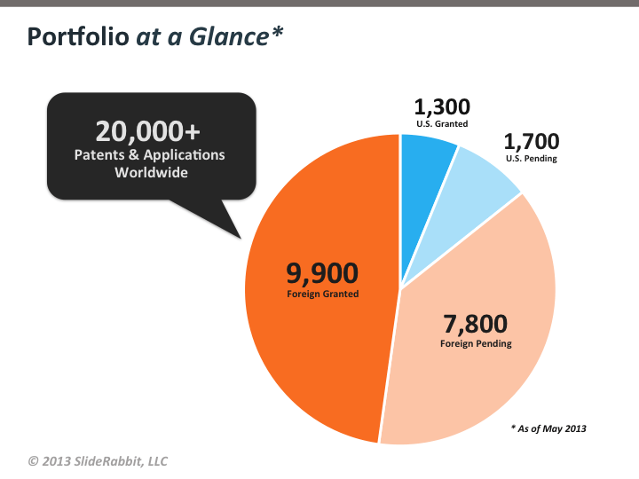 However, pie charts excel at showing general percentages in the break down of a larger whole. This pie chart gives a quick and easy to understand overview of the make up of a company’s patent portfolio and uses color to speed understanding of finer points: the blues group the U.S. patents against the foreign patents, and the paler colors group the pending patents against those already granted.
Selecting the right format for your data is crucial to proving your point and persuading your audience. Special attention should be paid to whether the data is displayed powerfully. Does it address the assertion in your title? Is it easy to understand quickly? Are your annotations and labels meaningful or extraneous? Good graph design is like any other good design. Everything that appears on the slide must have a reason for being there and it all must work together to create meaning.
Visit our portfolio for more slide design examples!*All slides in this post are taken from the body of work for one particular client. Sensitive information, including company identity, has been withheld.


Leave A Comment
You must be logged in to post a comment.